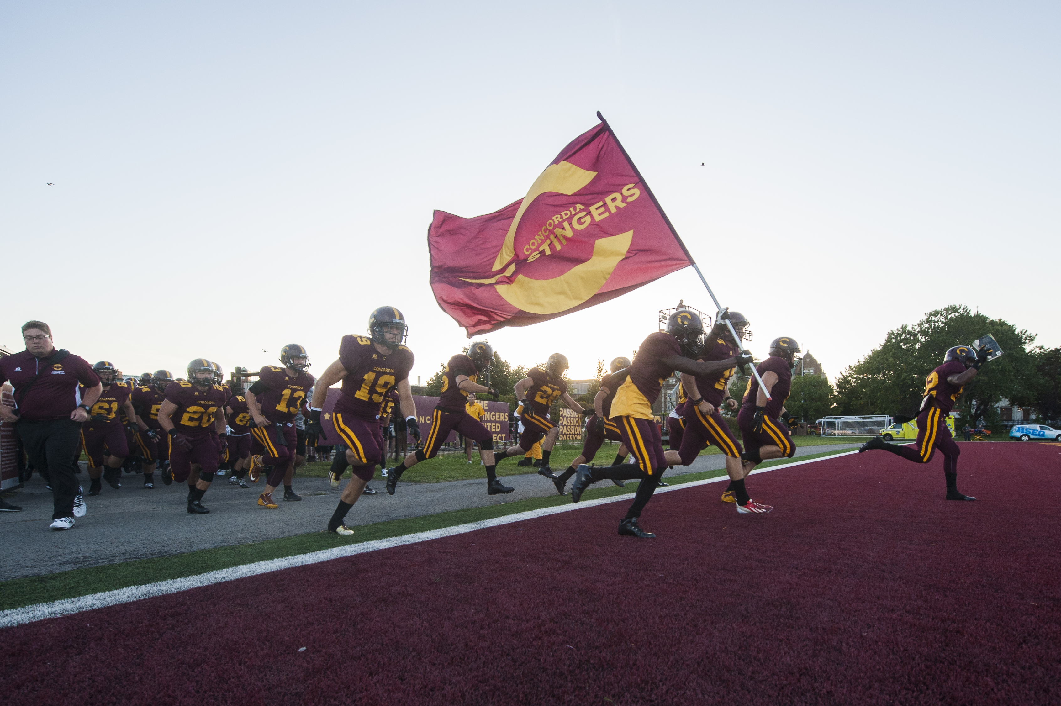
Pack your bags Buzz, Concordia’s logo is reinvented, refreshed and back bigger and better than ever

A new school year ushers in a new season for Concordia athletics. This year however, each team will also be sporting new uniforms, as the traditional Stinger bee logo has been disbanded. This comes after the university’s athletics department decided it was time for an aesthetic revamping.
Each team will begin sporting the new logo—which will still use the traditional yellow and burgundy—when they start each of their respective seasons this year.
“We wanted our new image to transcend sports and competition,” noted University President Alan Shepard. “We also had a unique opportunity to further strengthen the already deep sense of pride that exists within the Concordia community.”
According to Athletic Director Patrick Boivin, the purpose of Concordia’s rebranding is to help strengthen the Stinger pride between its athletes and students alike.
“One of our biggest challenges is … trying to harness attention and trying to build our fanbase and our engagement with our fanbase and the big priority there was the students” said Boivin.
[Based on] the feedback that we got from the student athletes, they themselves didn’t feel a deep sense of engagement towards [other sports teams]. They did for their own individual teams, but didn’t toward being a part of a larger Stinger group,” commented Boivin.Though the iconic bee logo will no longer be featured on the varsity team’s uniforms, it will still have a place on campus. For example, a mural of the stinger has been completed on the side of the football stands.
“We’re not going to be known and we’re not going to be seen primarily through the bee; it will be through the new logo,” said Boivin. “[But] we haven’t put the bee in the garbage, [it’s just] gotten a facelift.”
According to Boivin, the process of rebranding started almost as soon as he took the Concordia athletics director position in the summer of 2013. Since then, Boivin and his staff, along with the help of past and present student-athletes, worked tirelessly on the rebranding project.
“When you look at the logo, you clearly see … it’s very modern and at the same time it can be applied in a very retro and traditional way,” said Boivin.
“We thought it was a good mirror to the university itself: Concordia now is very strong on research, it’s very modern, it’s certainly trying to be a very innovative university and in that regard, the logo fits. It has a much more retro feel than the bee ever would have had.”
Boivin and his team hope the new logo will unite the school, regardless of on-field results.
“We have historically gone through a little more adversity [in comparison to schools like Laval]. We’ve never been one of those reigning schools at the top… I think we’re going to have go through more adversity in the next couple of years before we’re able to establish ourselves or our programs as being perennial contenders”.


