View of Lasting Impressions Vitrine Exhibit, Webster Library. Photo by Emma Bell / The Concordian
Webster library hosts a retrospective exhibition from Concordia’s special edition program.
As students begin to use the Webster library during the first few weeks of the school year, some may notice the vitrine display to the left of the entrance stairs. Concordia’s special editions program within the Print Media Department currently has a temporary exhibition on display titled Lasting Impressions. Founded in the 1990s by Judy Garfin and Cheryl Kolak, the program “fosters creative, collaborative and pedagogical opportunities for visiting artists, master printers and students.” This exhibit was curated by Director Erika Adams and showcases a retrospective collection of works produced over the past couple of decades that demonstrate the breadth of techniques that artists have engaged with.
The printmaking techniques range from lithography to screen printing, and each artist contributed a unique visual language to the body of work.
Lithography is a fairly complicated method that takes advantage of the way water naturally repels oil. A drawing made on a textured, stone surface with oil based materials is etched into the surface through a chemical process. Once the oily image is fixed onto the stone, the artist will pass a wet sponge over the surface before rolling on an oil-based ink. With the properties of oil and water at work, the ink will only stick to the oily image, while the watery negative space remains clean. The artist can now transfer the image onto paper by running it through a printing press.
The nature of lithography allows for a more detailed result—every mark made by the artist will appear in the final print, thus there is more opportunity for value, complicated linework, and an overall painterly appearance. Take Betty Godwin’s 2003 Escape for example: at a glance, this print appears to be a drawing. This simple lithograph features a diving figure whose elongated body is rendered with a quick hand. The diver’s limbs are mere suggestions constituted of hasty linework and smudged ink. A quiet object, perhaps a pillar, in the background softly emerges through more linework. This level of delicacy, texture, and value beautifully captures the possibilities of this method.
Betty Goodwin, Escape, 2003, Lithography on paper, 46 x 31 cm, printed by Chris Armijo. Photo By Emma Bell / The Concordian
In contrast, silkscreen printing, or serigraphy, lends itself toward the bright and the graphic. A method of choice for poster artists and activists, this printmaking technique favours boldness. The process involves separating an image into colour layers and turning those layers into stencils. The stencils are then fixed to a stretched silk screen, where the artist will then pass over with a squeegee to transfer the ink onto the paper layer by layer until the image is complete. Pierre Dorian’s 2008 print Stairs aptly demonstrates this technique. The bold lines, solid colours and overall graphic qualities of the staircase are highly characteristic of serigraphy.
Pierre Darian, Stairs, 2008, Silkscreen on paper, 76 x 62 cm, Printed by Mikael Petraccia. Photo by Emma Bell / The Concordian
The discipline of printmaking values the process of creation just as much, if not more, than the final print itself. As you spend some time with the works here, try to notice both the limitations and possibilities of each method and how it complements the subject matter. Lasting Impressions will remain in Concordia’s Webster library until September 25, 2023.
The Montreal Museum of Fine Arts displays 30 remarkable artworks from Albert Dumouchel, representing the evolution of his art style throughout his career
“Printing remains a simple, Austere Language– As I have often said, it’s like chamber music” – Albert Dumouchel.
Albert Dumouchel (1916-71) was a Montreal printmaking artist. He met London artist James Lowe in 1940, which inspired the start of his printmaking career.
An exhibition in honour of the late artist is located on the second floor of the Montreal Museum of Fine Arts, surrounded by white walls. The room is lit in a warm tone, dimmer than the lobby but matches the tone of the artist’s featured works. This exhibition displays 30 of his prints from the 1940s to the 1960s. His printmaking has been influenced by the development of art in many other countries.
In 1942, Dumouchel’s artwork “Pietà” marked the beginning of his journey. Unlike the traditional drypoint technique, in which an image is drawn on the plate with a sharp needle-like tool. Dumouchel decided to carve his images into a sheet of transparent plastic. “Pietà” demonstrated a picture of the Virgin Mary mourning the death of her son.
Although the overall lines of this piece are rough, the painted appearance on Mary’s face expresses strong emotions. The sharp white shapes in the background form a strong contrast with the surrounding dark round shapes, enhancing the viewer’s visual senses. His spiritual expression laid the groundwork for the later transformation of his artistic style.
In the late 1940s, Dumouchel turned towards surrealism, expressing external reality through his own psychological and poetic imagination. In “The Banners in the Night,” 1958, he used etching to show the technical improvement. Each line in the work flows naturally, twisting together to create the changeable forms of the wind.
In 1965, with the ascent of the Pop Art movement in North America, Dumouchel returned to figurative form in 1965. One remarkable technique he used was lithography. This technique was used in his piece “La mort de la cycliste” (The Death of the Cyclist), presenting his art in a completely new way.
Dumouchel returned to carving, making woodcuts late in his career, like his piece called “L’Horrible chat des neiges” (The Horrible Snow Cat).The penetrating gaze of the cat is what makes the work memorable. Referring to his earlier works, he has a talent of using minimal backgrounds to enhance the expression of the main subject’s manner.
Throughout this artist’s experience in printmaking, much of his inspiration has come from other cultures. “When I think of this artist, or any other artist, I would just think of his expression of art,” says one of the visitors. “Anything could be the inspiration, like what you learned and what you experienced.”
“As I learned printmaking, it was like a language I understood. How to make prints just felt very intuitive”
Some people are simply born to create. This is certainly the case for Aaliyah Crawford, the general coordinator of the Fine Arts Student Alliance (FASA) and co-editor in chief of Yiara Magazine. Since the age of five, Crawford has been creating art. She later went on to study printmaking at John Abbott College, where her interest in the medium flourished. She is now in her final year at Concordia where she is majoring in Studio Arts. Crawford spoke with The Concordian about her passion for printmaking, her creative process, and more.
TC: What appeals to you most about printmaking?
AC: I learned printmaking at John Abbott. At first I didn’t think I would like it. I was kind of confused by the whole thing. I was like, ‘why would you want to do something that a machine can do?’ As I learned printmaking, it was like a language I understood. How to make prints just felt very intuitive and I was really comfortable with the medium. It’s really fascinating, it’s very labour intensive.
But as I’ve been doing print now for nine years, I don’t feel the same way about it anymore. Now I’m really into monoprinting and book arts. I’ve been really enjoying that and finding different ways of using a medium that I think can be really rigid in a more flexible kind of way.
TC: What themes do you like to explore in your work?
AC: It’s a lot about me, it’s kind of like a diary or like a dream journal. I kind of meditate on my own experiences. For me, when I’m working, I don’t often know what I’m making while it’s happening. And then when it’s finished, I almost look back and learn secrets about myself that even I didn’t know. It’s really fun, but also kind of terrifying.
TC: Can you briefly walk me through your artistic process? How do you bring an idea to life?
AC: Lately I’ve been making a lot of books, so when I’m doing a book project I tend to be writing all the time. I keep little notes on my phone or computer, and eventually I’ll start to notice a theme. If I keep writing about the same thing or certain key words keep coming back up, something’s happening. Usually it starts with a title. I tend to know the title of all my book pieces before I make them.
So I’ll start to think about what I’m noticing in the work. I have a little studio space [at home], and I’ll take everything out. I work with a lot of different mediums, so I’ll take some stuff out and I’ll block off like five hours to make something. I’ll do that about five times and then I’ll go through everything I made and sort of notice a theme. Then I try to tease it out. I’ll work on the same pieces again, I’ll do a lot of layering, and revisit a lot of old things I made. There’s usually a lot of writing in my work, so I’ll edit what I wrote. Then I have to make it into a book, so I have to do the layout. When I make the book I either get it printed somewhere or I do it myself, and then bind the book.
TC: You mentioned that your work often centres on you, and that it’s almost like a diary. I was wondering if there are any particular pieces you’ve created that capture your experience as a Black artist? What have these pieces taught you about yourself?
AC: With my work being so autobiographical, it inevitably captures some of the essence of my experiences as a Black person. Some of my work has brought up memories from my childhood where I experienced racism before I really understood what it was. I think it left me with a feeling of being other, growing up in a predominantly white community. It’s been interesting revisiting those memories as an adult through my work and reshaping the narrative that I had internalized about myself.
TC: How has your work evolved over time?
AC: It’s becoming more honest and less fixated on perfection. I think when I first started making art I spent a lot of time making things that I thought other people wanted me to make. I think I was just trying to figure out, in terms of getting a degree and pursuing it as a career, how I could make art that’s marketable. Now I don’t think about anything (laughs). It’s so much more fun that way. I feel like when I started studying it in CEGEP, it kind of sucked the joy out of it, because everything I made was part of my art practice and part of some overarching creative narrative of my life. I longed for when I was a kid and I would make art for hours and hours on end, and I never really thought about what I was making or what it meant, if people would like it, if I could make money off of it, or if it was important. That’s why I wanted to be an artist, because I love that process.
For more information on Crawford and her work, please visit her website and Instagram.
Four Montreal-based creators share the impact of COVID-19 on their analog media practice
The hashtag #printisnotdead on Instagram has accumulated over 395 thousand posts as of April 2021. Not too bad for a medium that has been accused of irrelevance for the entirety of Gen Z’s existence.
Yet, it still manages to stick around. The COVID-19 pandemic has highlighted the importance of physical touch, with some feeling negatively impacted by the lack of it. Print, or analog media, is often more labour intensive, hands-on, and time-consuming than digital equivalents, usually yielding less predictable results.
So… why would anyone painstakingly hand print a poster when you could design it in Photoshop, and have it printed in a matter of hours? Has the pandemic had any effect on print? What even is paper art?
Four Montreal-based creators who have adapted, reworked, or dove head-first into an analog practice during the lockdown explain the connection to The Concordian.
Caitlin Yardley / Disposable Film
Caitlin Yardley, a Journalism graduate, is experienced in digital media production. For a recent birthday, she was gifted a disposable camera to experiment with.
Like many ‘90s kids, she used a one-use film camera as a child, explaining that her family has albums upon albums of old photographs. But it wasn’t until the lockdown that she fell for film.
“I really want to preserve every moment now,” said Yardley. “I love the permanence of getting my film developed and holding onto a photo, or when I hand a photo to a friend I’ve had printed it feels really special. So that’s been what has led me to continue with the medium.”
Because of the pandemic, some of Yardley’s friends have moved away and she sees less of the ones that are around, naturally. She explained that the experience has led her to cherish the time she spends with loved ones even more and that film photography is an enjoyable way of making the moments “concrete.”
“I always lose the photos on my phone, or even on my [digital] camera, I’ll upload them somewhere and forget about it,” explained Yardley. “But I’ve been printing off these photos and sticking them on my wall.”
Something that Yardley likes about disposable film cameras is how accessible they make photography, especially compared to high-tech DSLR cameras or finicky 35mm film, which require the user to have experience and skills the former doesn’t.
“With some analog film it’s different, but if you just have a disposable camera anyone can get a super cool photo,” said Yardley. “If I’ve had a bit too much to drink I can snap a photo and as long as the flash is on I know it’s going to be good.”
Yardley explained that disposable cameras are very user friendly, requiring only two controls to function, meaning it’s also easy and quick to instruct others interested in learning about the medium. “As long as your finger isn’t over the lens that’s all that matters,” she said.
“With digital, you can take 100 photos to make sure you get the right one. With film, you have one moment realistically, maybe two, to line up the perfect shot and that’s it,” said Yardley. “You don’t know what you captured, you don’t know if it was just your fingerprint. Three weeks later when you hand the film in and it gets developed — then you know … It’s just not an experience you get with digital.”
Yardley explained that this is exactly what makes disposable film unsuitable as a tool for fast-paced, precise photojournalism required at a protest, but that she will continue to make sure she has a disposable camera ready for capturing special events creatively.
She encourages anyone interested but hesitant of the medium to try it out.
“Pick up a disposable camera and if you do have the pleasure of being around people you love, go out and try to shoot something,” said Yardley. “It’s going to be beautiful no matter what.”
@gorelickart / Linocut Printmaking
@gorelickart* is a Montreal-based artist, in her first year of Studio Arts at Concordia University. At the start of the pandemic, the multi-disciplinary creative found themself living in a small studio, shared with a now-ex partner and a cat. Painting, also a part of their artistic work, proved a good way to collect cat hair in a small space.
They took a printmaking course at Concordia during the fall term and started to learn more about the many distinct forms that fall under the umbrella term of printmaking.
“I didn’t use to draw or do any realistic work, but in printmaking, I’ve started to explore that with linocut and intaglio,” they explained.
Compared to linocut printmaking, which developed in the 19th century, intaglio is a grandmother, originating in the 15th century. Intaglio could be described as chemical engraving — the design is etched onto the plate and then acid is poured over it. Intaglio and linocut are on opposite ends of the printmaking spectrum because the former is an example of incision printing, where the design is essentially inside the plate. Linocut and woodcut, require the artist to carve away everything but the design, making it stand out from the cut-away parts in an almost 3-dimensional manner. They are examples of relief printing.
She was initially drawn to lino, which is short for linoleum, the same material also used as flooring, to create a @gorelickart 2020 stamp for her paintings.
“I bought a 4 by 6-inch piece of rubber, and obviously my stamp was tiny so I just started experimenting more with that,” said @gorelickart.
YouTube videos and a can-do attitude proved helpful.
“I just got the tools and started doing it. I was just carving on my couch, with the block in my hand. So whenever I would miss or [the block] would slide a bit I would stab myself and be like ‘Ahh!’ As I was presenting my piece someone in my class was like ‘You know you’re meant to use this thing to keep the block in place … That would have been good to know, but I guess that’s part of the process of teaching yourself.”
Like many analog methods, linocut printmaking involves several labour intensive steps. Carving a block and printing it are two separate tasks, and @gorelickart prefers the former. They use intaglio inks, which can be hard to clean up and stain easily. She chose a composition of a fish created earlier in the year as one of her favourites, as it is one of the pieces she has cared enough about to go through the process of printing and not just carving.
“I really love carving, I find it’s such a relaxing process. I can do it very absentmindedly, almost like knitting,” she said. “I just sit on the couch, [carving] my block and watch TV and it’s really relaxing. Versus printing that’s more technical, and I’m more stressed about not getting ink everywhere.” They use intaglio inks which can be hard to clean up.
@gorelickart explained they live alone and don’t see friends often with respect to the pandemic regulations. Tactile parts of their artistic practice, such as carving, working with stained glass, and clay have proved deeply helpful in terms of dealing with the difficulties that can lead to.
@gorelickart was inspired by another artist on Instagram using small scraps to make recycled stamps. It prompted them to start reusing their wine corks and linoleum scraps to make custom stamp-sized designs.
“When I was doing bigger blocks I would have so much waste from my carvings and I was like ‘Oh my God I need to do something with this’ … So I just started making tiny little carvings and putting them on the corks. They’re so cute and I love them, but now I have so many I’m like, ‘What do I do with these?!’”
In the future — commissioned stamps, or ones with letter grades for teachers are a possibility but, “Right now I’m just making them for fun when I have extras,” they said. “Printmaking is a pretty low-waste art form compared to painting but it’s important to use everything. Before I was just throwing my wine caps out, so I was like this is pretty perfect.”
Silvana Toma / Papermaking
Some might assume the term “paper arts” means art drawn or painted on a piece of paper. Not Silvana Toma, a lifelong paper collector who likes to leave journals and notepads empty, finding them prettier that way.
Toma visited Japan a couple of times and was fascinated by the process of washi papermaking, a thin yet super-strong paper handmade locally, using ancient methods.
“Even though I enjoy both, I’m more drawn to analog [than digital]. It’s so tactile and hands-on that it helps me disconnect from the world for a little while and only focus on what I am doing in the present moment. Because of this, it’s been super beneficial to my mental health too. It’s also as close to a form of meditation as it gets since I can never sit still for too long,” explained Toma.
She turned her affection for stationary into concrete action, launching NoteStorii, a handmade paper shop, in early 2021.
“In some aspects, lockdown helped since I probably wouldn’t have launched so soon if I wasn’t forced to stay in the house and actually work on this. In general, there’s no easy part about starting a business, especially when you’re a one [person] show,” said Toma, detailing the specific challenges the pandemic has imposed on her fledgling business. The physical store closures made it difficult to source materials, the increased use of Canada Post caused shipping delays and on top of everything, lost packages “didn’t help.”
Papermaking is a highly tactile art, requiring multiple technical steps to get to the final product. A benefit to small-batch paper is that it has a significantly lower eco-footprint than coated, commercially produced paper.
Scraps can be recycled into new paper, but it’s important to understand what its texture is before committing to making it into sheets. This wasn’t always possible with online shopping, sometimes leading to unusable supplies, paired with high shipping costs for Toma.
“I think I’m not the only one who’s been living through the lens of social media pre-pandemic, always plugged in, always going somewhere and checking items off of my endless to-do list. The lockdown forced us to face who we really are beneath the filter we put up for the world, and we either weren’t ready for the reveal, or we didn’t like what we saw. It can cause a lot of anxiety and unrest you know — realizing you don’t really know yourself? I think analog mediums help us tap into a creative side that we’ve perhaps forgotten about; we can take time to think clearly, instead of frantically searching for answers even though we’re too distracted to ask the right questions,” she continued.
“At first I saw papermaking as something only professionals with huge studio spaces could do. I’ve learned that a small workspace doesn’t mean you can’t enjoy the process. It’s also an inexpensive hobby. You don’t need fancy equipment, big machinery or grade A pulp to start off. I began with a kitchen blender and still use the same one, recycled newspaper and a DIY frame from the dollar store. With a bit of patience and willpower it’s a rewarding process,” she said.
“My favourite part is peeling off the dried sheet and stacking them for the final press. The peeling sound and motion feel incredibly satisfying, and so is seeing the final product,” continued Toma. Making paper is physically intense and messy — but it’s a labour of love for the creative entrepreneur.
“I remind myself that cleaning up means I get to come in to a fresh start tomorrow.”
Le Lin / Book Arts + Print Media
Le Lin is a prolific presence in the print world. In their final year of Graphic Design at Concordia University, Lin has shown art books in several exhibitions, produced multiple zines, and co-founded the Queer Print Club (QPC) two years ago — to name just a few of their analog accomplishments. However, he’s also seen aspects of his communal practice, like participating in Expozine, or a print swap the QPC co-organized with Yiara Magazine, become impossible due to the pandemic.
Lin has approached book arts from multiple angles, studying binding and conservation methods that the average person has likely never heard of, seeing a book as a unique 3D artistic creation, as opposed to just a vehicle for other people’s words and images. The distinction is important.
“I always design for print … I use very specific papers. I really care about the transparency and the papers and the materiality of the book itself … A lot of my books you can fold stuff out or it’s bound in a particular way,” he explained.
Lin combines their skills as an artist and graphic designer to create art books. A set two, handmade by Lin, were recently displayed in Dear Family: twenty years ago was just yesterday, at the Pierre-François Ouellette gallery, from March 17 to April 3, as a part of the annual Art Matters festival.
“When [people] open [one of my books] and see that I’ve done the whole cover, embossed the cover, and screen printed most of the transparent pages and then digitally printed all of the other pages and sewed stuff in and they’re like ‘Woah you can do that!?’ and I’m like yeah, you can do anything!”
Lin is in Design, but they have made the effort to pursue printmaking classes throughout their undergrad career, emailing teachers tirelessly to get into the courses needed to further their practice.
“This year shifted a lot. I really wanted to take papermaking and 400-level screen [printing] classes and other hands-on classes like bronze casting but because of COVID, I can’t go in, so I’ve been taking more coding and web design classes. I have made three zines this year but they’re not printed by me,” said Lin.
“One of the projects I’m working on is making a web platform for zines, so you can upload PDFs and it turns into flipbooks online, so it’s kind of bridging that gap. I haven’t partaken in much printing at home but it’s more like translating my practice onto an online skillset,” he continued.
The site features zines by Lin, as well as some that others have uploaded. Taken from the word “magazine,” what makes a zine distinct from traditional media is that they’re self-published and have a long history related to activism or the dissemination of information that is helpful to marginalized communities. They’re known for their blend of educational, personal, artistic, and affordable content.
“I like making things that are accessible … With my work I try to make it super precise. If you can read it, you can understand it.”
*Identity has been withheld for safety/privacy reasons.
Students in a Concordia print processes class were given the opportunity to display the work they produced this term. Photo by Mackenzie Lad.
Australian exchange student exhibits work as part of Concordia printmaking class
During Ali Watson’s first Canadian winter, she featured her artwork in a Montreal gallery. The 21-year-old exchange student from Australia’s Curtin University faced a starkly different reality this semester compared to the year-round heat of her hometown of Morley.
Her series, featured in Atelier Galerie A.Piroir, contextualizes her experience of being in Canada. It is a response to this new environment and the environment she sees outside.
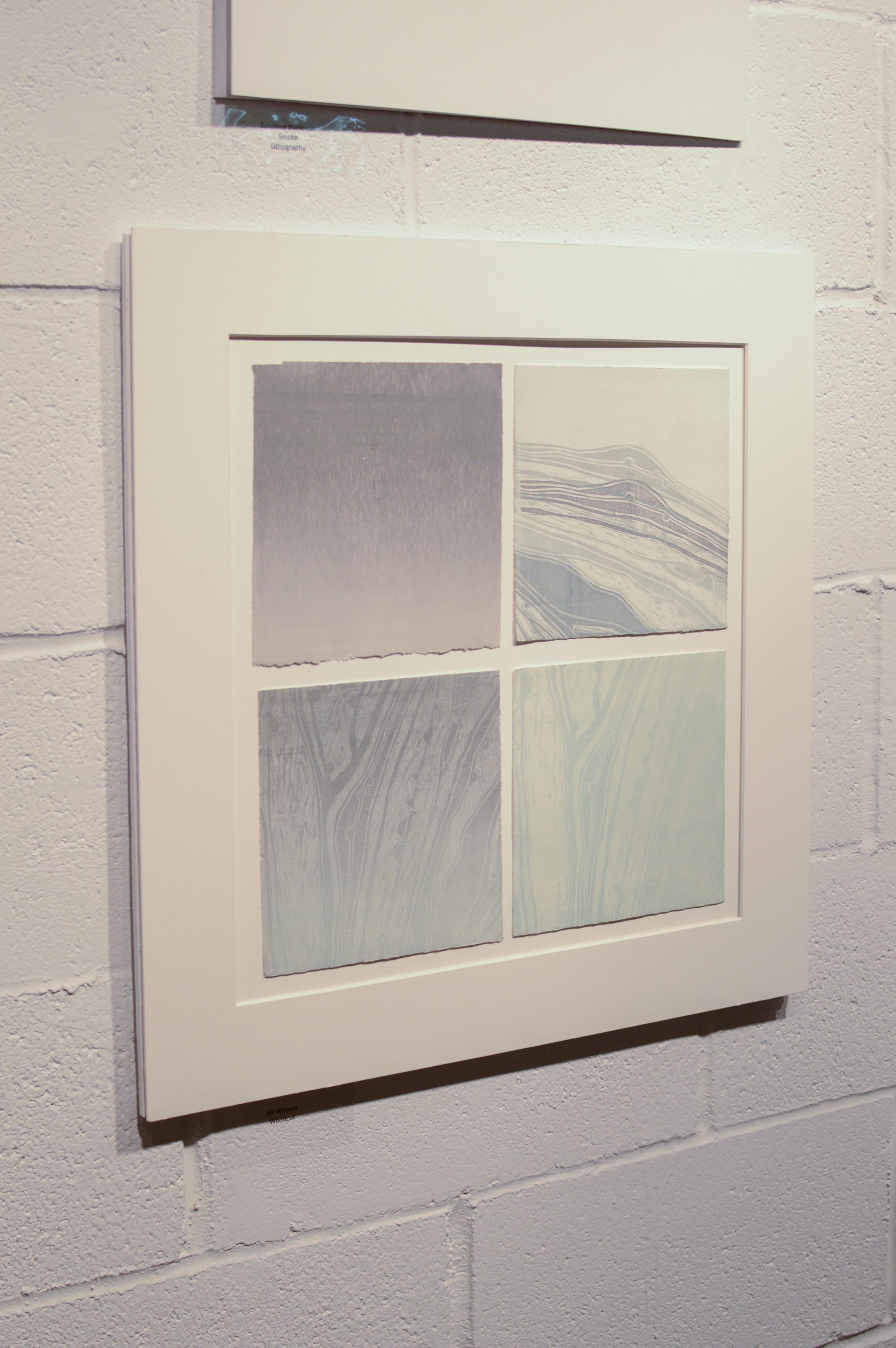
While on exchange, Watson has lived on Concordia’s Loyola campus, where the view outside her window inspired her artwork, a series of four seven-by-seven-inch woodblock prints. “It is a study of a bush outside of my room’s window […] depicting different weather conditions at various times of day,” she said. “I look out my window everyday and see the bush.”
“I mixed my own ink for my series,” she added. “The colours I used reflect what I saw outside, particularly greys, whites and light purples.”
Watson is a printmaker in her last semester of a fine arts degree. “I was chosen in my print processes class to be featured in the annual printmaking exhibition; it focuses on woodblock printing,” she said. Along with other Concordia students, Watson had the opportunity to help set up the opening of the exhibit, which consisted of curating the works and displaying them in the space.
Ali Watson’s piece is made up of four seven-by-seven-inch woodblock prints. Photo by Mackenzie Lad.
“I really didn’t think much about it before I did it,” Watson said with a laugh, reflecting on the inspiration for her project. She described her untitled series as being “about winter and the visibility that winter has on nature. I tried to focus on snow and how it changes the outside landscape.”
A theme throughout her work is the connection she feels with places even when she is not there. “It is kind of like a tactile memory that forms. I focus on structural surroundings that create a sense of memory and familiarity—the constant things that are always there,” Watson said.
Places that evoke nostalgic memories subconsciously create the meaning behind her work. “My work is always about what’s around me. In Montreal, everything I have made has been about being here.”
According to their website, the Atelier Galerie A.Piroir specializes in the creation and exhibition of printmaking. Although she was familiar with the printing process, Watson had never used woodblock prior to this experience, and the carving element was new to her. “I haven’t worked with imagery in a while, because I usually focus on installations. To actually have to design something was challenging.”
Woodblock printing is a detailed and timely process. Once the artist has carved the wood with chiseling tools, it is inked with a roller and run through a press. Every print goes through the press at least three times and holds multiple layers of ink. Printmakers carve out different sections and print on top of them to achieve intricate designs.
“My work portrays home, but not in the traditional sense,” Watson said, referring to the typical use of people to symbolize home. Instead, the colours and textures she chose reflect this theme, and she relied on icons to “reflect a sense of home and belonging.”
“I think home is a feeling that is created,” she added.
When Watson started printmaking three years ago, she did not like it. “I came to realize that it let me produce the most exciting outcomes,” she said. Since learning the process in Australia, printmaking has been Watson’s focus for the past three years.
“I was a boring painter,” she said with a sigh. “I do like sculpture though, and some of my prints become sculptural, as in they aren’t just flat on a wall. The paper itself becomes a sculpture.”
Watson said she hopes to work as a practicing artist and business owner in the future. “I want to eventually do a master’s degree in something that isn’t necessarily art. I would like to maybe do social work and then find a way to link the two,” she said.
The exhibition, which features the work of Concordia printmaking students, is on display at Atelier Galerie A.Piroir until April 7. The gallery is open from 12 p.m. to 6 p.m., Tuesday to Friday.
From left, Rosamunde Bordo and Laurence Pilon pose next to their work. Photo by Alex Hutchins.
Deçà Delà: From painting to printmaking, artists share meditative processes in a joint exhibition
“Deçà delà” is a French expression meaning to unite two separate sides, places or ideas as a way of expressing variety and highlighting differences, while introducing a subject as one cohesive matter.
The current exhibition at Ymuno Exhibitions takes inspiration from this expression, and unites two artists of different mediums—painting and intaglio printmaking. Rosamunde Bordo and Laurence Pilon are both recent Concordia graduates, and share similar approaches to their art. Both artists work in layers and restrict themselves to simple colour palettes.
Bordo holds a bachelor’s degree in Western society and culture, and a minor in print media. Her work is inspired by landscapes, topographies and maps. “In my practice,” Bordo explained, “I toy with the notion that the physical act of making is like an act of remembering. Through recording, repeating and multiplying, I use different techniques in print media as forms of documentation that undergo processes of mediation and transformation.”
Bordo transforms her initial inspirations into symbols, such as the arch and the window, two of the most prominent symbols in her work.
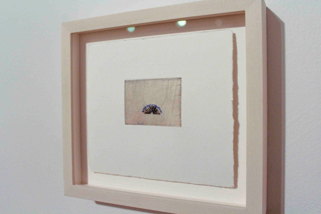
Arch IV is a small, unique print of 12 variations. It was created by Rosamunde Bordo this year. Photo by Alex Hutchins.
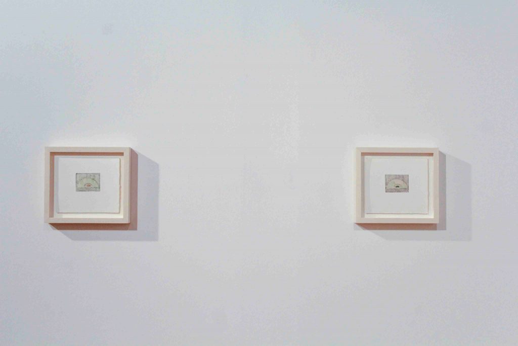
Bordo starts by etching into a copper plate covered with resin. She then dips the plate in acid, which eats away at the areas where the resin has been removed, creating an image or template. Bordo has made 12 of these etchings, and each final print is composed of at least one plate. Some are created by layering several different plates. Arch II and III are nearly identical, but one has one less plate than the other. Arch IV stands out from the rest as Bordo used fewer plates and focused more on the colour. Bordo said she wishes to “emphasize tactility as a way of addressing notions of presence, temporality and change, and use subtle gestures and suggestions to consider broader cultural implications.”
The idea behind the use of arches in Bordo’s work comes from her experience in Maine this summer. According to Bordo, the arch symbolizes the sun. Whether it sets or rises, the sun always encompasses the whole sky. Its light seems endless, yet Bordo limits it by containing it within a geometric shape in her etchings. One striking commonality between Bordo and Pilon is the size and colours of their work. Bordo’s prints are, on average, three by four inches in size, while Pilon’s paintings are all about five by seven inches. The size of their work renders the exhibition quite intimate because the pieces change drastically when viewed close up or from a distance.
Arch II and Arch III are nearly identical. Photo by Alex Hutchins.
Pilon graduated from Concordia in 2015 with a bachelor’s degree in fine arts. Her work has received great distinction, and she has been awarded several grants and scholarships in support of her art, including the Betty Goodwin Prize in Studio Arts and the Lise-Hélène Larin Scholarship, both awarded by Concordia.
Pilon’s process begins with flipping through books and studying archives, art history and music. The musical influence of Claude Debussy, a classical French pianist, is prominent in her work. Pilon urges viewers to listen to Debussy’s music and think of the light it emits when looking at her own work. Like Debussy’s compositions, some of Pilon’s pieces are light and airy, while others are dark and sombre.
Pilon may start painting based on what she sees around her, but ends up with something completely different. This journey is the most important part, in her opinion. In the transformative process of layering and uncovering, Pilon’s work is muddled with the regeneration of her paintings. That is, she paints over something, sands it down and repeats this action until she is satisfied.
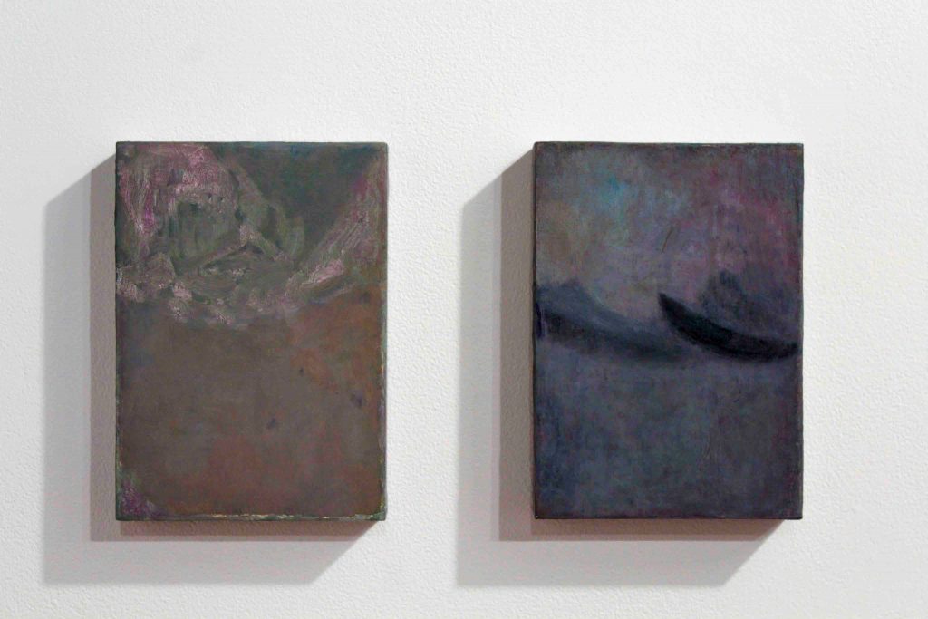
Pilon alludes to industrial materials like concrete and steel, shown here in Multi Blue (Clematis) and Avant Garde (Peony). Photo by Alex Hutchins.
The artist regards her pieces more as objects than works of art. In her artist statement, Pilon wrote, “my paintings-objects can also be interpreted as critical responses to contemporary conditions of consumption, endless expansion and instantaneity.”
She is inspired by the arts and crafts movement of the 1920s and postmodern strategies of artmaking. The artist also listed the post-impressionist artists known as the Nabis, the set designs of the Russian ballet and colour field painters as specific inspirations to her work.
Some of Pilon’s paintings have an intentional dusty quality. The artist allows her paintings to gather dust as they dry. She mixes paint dust gathered from the sanding process to emphasize this effect. She paints to capture changes in her subject’s form and its relationship to light.
Pilon’s paintings often mimic other materials, like cement, sand and metal, as is evident in Multi Blue (Clematis), and Avant Garde (Peony).
“Encouraging in their viewers a prolonged visual engagement,” Pilon said, “the resulting objects evoke a sense of timelessness and indistinct familiarity, while communicating paradoxical feelings of fatigue and hope.”
Deçà Delà will be on display at Ymuno Exhibitions until Dec. 16. Ymuno is a joint gallery space and studio for artists Madeline Richards and Ben Williamson, and is located on the fifth floor of the Belgo building (372 Ste-Catherine St. W., studio 530). The gallery is open Thursday to Saturday from 1 p.m. to 5 p.m.