Categories
Opinions

VA stands for Viciously Average

The Visual Arts building used to be a parking garage, and it shows.

If you’re not a student in fine arts, you might never have had the privilege of witnessing this fine institution. Allow me to paint you a picture: imagine a bland, grey-brown box filled with austere, harshly-lit studios. That about sums it up. 

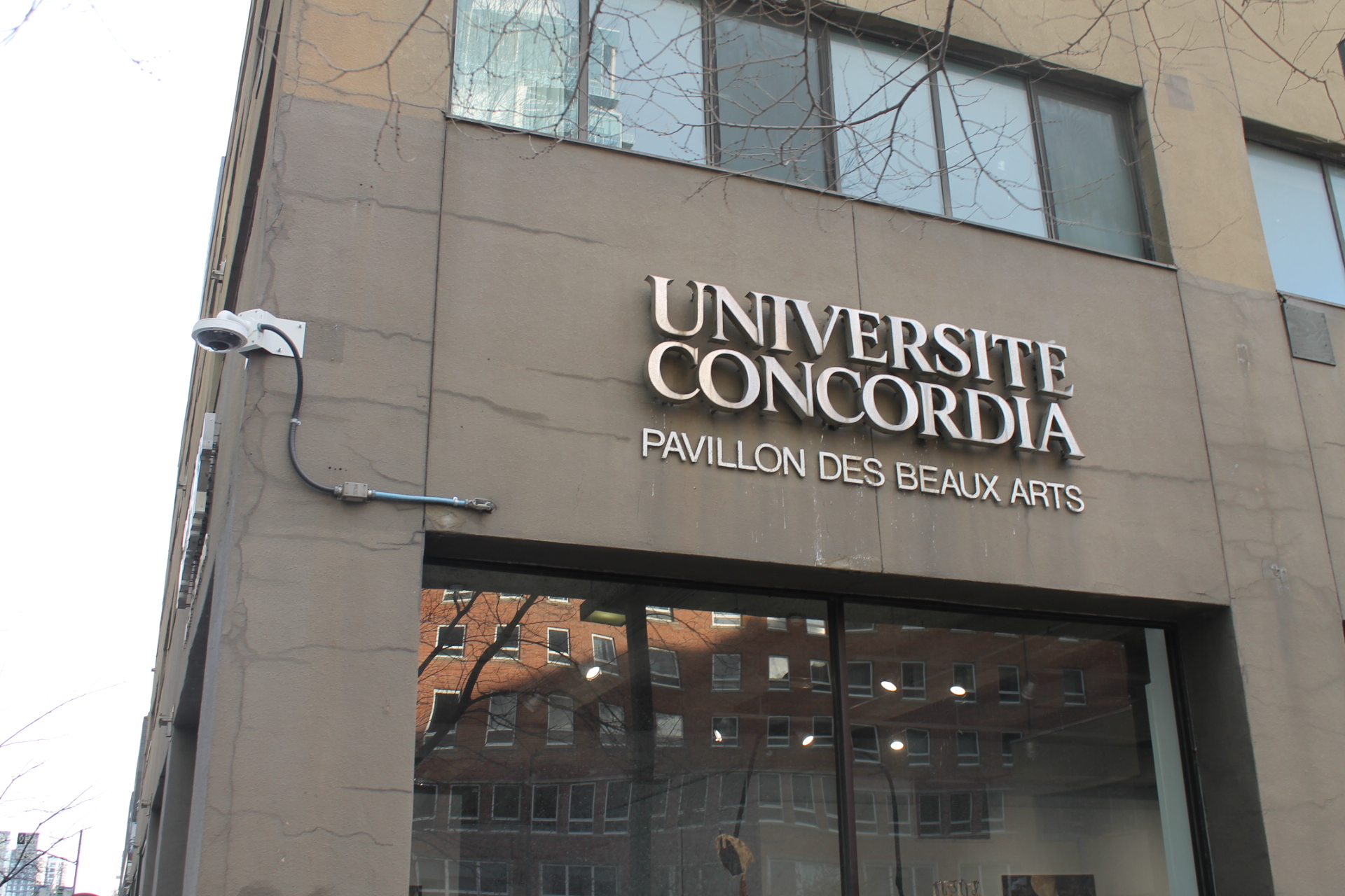
The VA Building is located on René-Lévesque Boulevard., about a five-minute walk from the core of the downtown campus. Before the EV Building transitioned to hold a number of art facilities, the faculty of fine arts used to be concentrated in the VA. At one time, the building’s atmosphere was much more lively—there even used to be a student-run café called Café X, until it was closed in 2017. 

Thinking about this building’s missed potential reminds me of recurring thoughts I have about architecture and how under-utilized many spaces are. We spend so much of our lives indoors; I think these spaces should be as beautiful as possible. It’s especially ironic for an arts building to be so un-artistic. 

The exterior walls of the VA Building seem like the ideal candidates for colourful murals, but are instead blank and gray. This makes what they call a “brutalist” architecture even more foreboding and doesn’t exactly foretell an inspiring atmosphere. Imagine if students were tasked with the job of beautifying the building, and how inspiring it would be to walk into a giant work of art (to go create more art!).

The issues with the building are not just aesthetic, however. Numerous factors make learning an unpleasant or even inaccessible experience. There often seems to be issues with the toilets (especially on the third floor), and the water fountains have been ineffective almost all year (they’ve been replaced by water coolers, to be fair, but still). Don’t even get me started on heating—what began as an icebox has turned into a furnace, and these fluctuations seem to occur minute by minute. Rumour has it that the ceramics studios needed a space heater brought in to help with temperature regulation.

What’s more, the VA Building is often referred to as a food desert. Without any food options nearby, students have spent many evenings nourished only by vending machine cookies. (Yes, I should probably get better at meal prepping, but still—food should be cheap and accessible for students, especially given the brutal four-hour studio classes.)

Sometimes I imagine how wonderful the space could be. My utopian vision for the VA involves a brightened exterior, a revamped student café, and improved social spaces. Students do better work in better spaces, and art should be done in a place that evokes inspiration (and comfort!). 

In the meantime, things could always be worse. Actually, I lied—the vending machine was out of two-bite brownies the other day. We have truly hit rock bottom over at the arts building. From now on, every time I create a seriously mediocre painting, I’ll just blame it on this Viciously Average building.

Categories
News

Concordia University Press hosts the best of the best in Book, Jacket, and Journal design show

The Concordia University Press wins three spots in the AUPresses Book, Jacket, and Journal Show.

They say not to judge a book by its cover, but that is exactly what the AUPresses Book, Jacket, and Journal Show is all about. 

With three books winning a spot in this year’s show, Concordia was eager to host the final stop in this year’s show. All 83 of the best designed book and journal jackets and covers from university presses around the world were on display at Concordia’s 4th Space on Wednesday, Jan. 31. Alongside all selected winners on display, the Concordia University Press was also excited to host a panel with award-winning designers, Sébastien Aubin and David Leblanc, designers in cover design and typography respectively.

“It was terrific that we could host the show at the same time that we had three mentions in the same year,” said Ryan Van Huijstee, the acquisitions editor at the Concordia University Press. Van Huijstee has dreamt of hosting the show for more than a decade now. Having worked in scholarly publishing for 17 years, he really wanted to show off the great work that the industry does. As a traveling show, the AUPresses design show makes stops at various member institutions all around the world, this year Concordia was lucky enough to host.

As a relatively new press, launched in 2016, it meant a lot to Van Huijstee that the Concordia University Press had three mentions in this year’s best book jackets and covers out of 83 of the almost 14,600 published works annually. 

With the new press “still trying to find [their] place within the larger industry,” Van Huijstee explained what they will focus on going forward: playing to the strengths of the institution it resides in, with a strong commitment to visual arts and social sciences.“I think that was very clear from the beginning when it was founded by Jeffery Little and our colleague Meredith Carruthers. They were very keen to ensure that the press had a distinct visual style” said Van Huijstee. 

One book from the press that ties in both elements of the press’ ethos is Canada’s Place Names & How to Change Them by Lauren Beck. Beck’s book won the best cover design award with Sébastian Aubin and his studio, OTAMI-ᐅᑕᒥ’s, interpretation of two 17th century maps that are referenced in the book. 

Original map of Wendake drawn by Jesuits in 1631, which inspired Aubin’s interpretation for Beck’s book cover. Archive from Library of Congress

In this interpretation Aubin and his team flipped the map of Wendake drawn by Jesuits in 1631, Description du pais des Hurons, originally detailed by Jean de Brébeuf and altered the colors with the purple representing wampum beads. Its simplicity and electric use of color were noted by the jurors. 

Along with the Concordia University Press’s commitment to visual arts, they also were founded on the commitment to being open access. Most other corporate or university presses are built around making as much profit as possible. However, Concordia University Press is “making an important contribution to our own history where it wouldn’t be necessarily served by a larger publisher,” according to Van Huijstee. As Concordia’s press is the second university press founded on open access following Athabasca University in Alberta, they are setting an example for others to follow.

Categories
Arts

Pretty on the inside and for all to see

Art and science come together in Illustrating Medicine

If you’ve taken classes in biology or medicine, you have undoubtedly come across hundreds of illustrations showing different parts of the human body. What probably did not cross your mind is the fact that someone drew these illustrations by hand, maybe a half-century ago. One of the illustrators could have been Dorothy Foster Chubb or Nancy Joy, who are having their work celebrated in Illustrating Medicine, an exhibit showcasing original artwork created for Grant’s An Atlas Of Anatomy, published in 1943.

The Atlas is a textbook for medical students and professionals worldwide, known for its detailed anatomy illustrations. Since 1943, it has been republished a dozen times and remains one of the most used textbooks in the field. Unlike other anatomy books including Gray’s Anatomy, which organizes the anatomy by system, Grant’s Atlas was one of the first to show the body by region. Readers looking for information about a particular area of the body, such as the skull, would be able to see all the details of the skeletal, muscular and circulatory systems in one chapter or diagram.

Illustrating Medicine showcases the beauty contained not on the outside, but the inside, literally. Photo by Natasha Taggart

The exhibit is displayed in the same order as the first editions of the atlas, starting with the upper limbs and abdomen, to the pelvis and lower limbs, ending with the vertebrae, head and cranial nerves.

Illustrating Medicine shows a few dozen of Chubb’s and Joy’s original artworks, and a ‘behind-the-scenes’ into their process and collaboration with Dr. Grant.

In order to cut costs in production and make the book affordable, Grant’s Atlas did not publish their illustrations with the same amount of detail as the originals. The exhibit is an opportunity to see the works in full detail as they were created, with expert precision and accuracy. Most of the sketches were based on photographs of dissections, which were then traced and consequently made into drawings.

The illustrations were made using different techniques including carbon dust, line drawing and black and white watercolour painting, with each artist sticking to their prefered method. Line drawings often depict bones and venous systems while carbon dust is especially effective for demonstrating muscles and fatty tissues.

Illustrations of anatomy have proved to be more useful than photographs as it allows the reader to see through the different systems. Unlike in a photo, drawings allow you to see the bones, muscles and circulatory system. The artists can play up important elements by using different techniques with highlights and shading. The highlights are key when a specialist is referring to them while performing a dissection.

Looking closely at the drawings, it is difficult to process that someone was able to sketch out intricate details of the human body with such precision. Several illustrations are so realistic that it’s hard not to feel squeamish, but overall they are presented in a way that simply makes you feel in awe of the artists’ talent. Whether or not you are familiar with illustrating, you quickly develop an immense appreciation for the work that went into the drawings and the time it takes to illustrate medicine.

Illustrating Medicine is displayed at the Loyola Campus CJ building Media Gallery until May 1. For more information, visit coms.concordia.ca/illustrating-medicine.html.

Photos by Natasha Taggart

An example of a drawing based off a photograph of an arm

Categories
Arts

Don’t look up at the starry night — look down

The Astronomy Legacy Project is working to preserve pictures of our galaxy on our screens

Looking up at a starry sky, it is easy to get lost in the immensity of it. When using a telescope of sufficient strength, every planet and galaxy becomes a unique and beautiful entity. For over 120 years these images have been recorded on glass plates. The Astronomy Legacy Project (ALP) aims to give the public access to over hundreds of thousands of plates online at no cost. To reach their goals, however, they need the public’s help.

Pisgah Astronomical Research Institute (PARI) is a non profit, educational organization committed to bringing the ALP to life. Founded in 1998 on a former NASA tracking site in North Carolina, the organization soon began exploring the possibility of archiving astronomical plates.

PARI has initiated a crowd-funding drive that will help make historic images of the night sky available via the Internet to the general public, scientists and students worldwide.

According to ALP’s principal investigator, Dr. Michael Castelaz, the collection of plates began with a gift of over 20,000 plates from a retiring professor. Since the initial donation, the archive is now home to over 220,000 plates with more being received from institutions across the continent.

The contents of these plates range from surfaces of planets to nebulas. Although the current offerings are in low resolution, one cannot help but be mesmerized by the intensity of the images. Halley’s comet racing through the sky is as impactful through a black and white photograph as it is seen in person.

Perhaps the most striking of these is a photograph in colour of two galaxies colliding. The star systems themselves appear red and yellow against a blue backdrop. Although physical motion cannot be captured in such a format, the plate feels emotionally charged and timeless.

As it was clear that ALP was privy to something so significant yet fragile, special care was taken to address the challenges that could prevent their longevity.

The immediate issue presented was how to preserve these images both in the short and long-term. Storage for the physical plates was possible in an unused building on the site, which NASA helped bring to archival standards. One problem persisted — how to save these images for further use and enjoyment. As all the plates stored at the facility are unique, should one break, the images are gone forever.

The ALP’s current project is to individually digitize these plates so as to preserve them for the long run. This will not be easy as there is no standardized format for the glass plates. They range in size from a few inches to two feet and can be rectangular or circular. Since they all differ, many machines that may be used to digitize the images would be ill-equipped for this purpose.

Currently, the ALP does have a machine donated by NASA that is capable of transferring one plate per hour. At this rate it would take over 100 years to digitize the plates they currently have during which time some specimens would be lost forever.

To speed up the process PARI has turned to crowdfunding to try to raise $60,000 for a more effective scanner, the OPTEK 463 VSM. When asked of the benefits of pursuing this funding source, Dr. Castelaz stated that the fundraiser is a great way to let people know about the project.

Crowdfunding, as opposed to government funding, allows for the immediate feedback of donors according to the director of the Astronomical Photographic Archive, (where the plates are stored), Thurburn Barker. Furthermore, appealing to the populous avoids issues such as the fiscal climate or political whims which may make government funding unavailable.

Since the public aspect of the project is present in every element, the turn to the community for support becomes logical. Public participation is a small request for such a wealth of free, public information for us and for future generations.

For more information about PARI and the Astronomy Legacy Project visit pari.edu. To view the current crowdfund visit indiegogo.com/projects/astronomy-legacy-project.

Categories
Arts

ARTiculate: A blank canvas; an empty screen

In recent memory, the advancement of technology has increased the popularity of video games and their production. As the home-based video game turns forty, an argument has been raised as to whether or not video games can be considered art and whether the practice of gaming is an art form.

Beginning with The Odyssey video game console (manufactured by Magnavox and released in August 1972) popularity, accessibility and advancement in home-based video game consoles has grown exponentially with companies such as Microsoft, Sony and Nintendo leading the way into the 21st century.

Video games have gone from simple graphics of a ball bouncing from one side of the screen to the other to three-dimensional, extremely detailed games such as Halo IV and Assassin’s Creed III. In recent years the production of video games has taken on new levels of complexity. Real actors are sometimes used for the characters in the games; historians are needed for the accuracy of the time periods; costume designers and architects for the clothing and building designs; as well as musicians and composers for the background music.

Furthermore, the storyline of a game takes as much creativity and is as complex as an author’s plot for a novel. Inevitably, video games take just as much research, creativity, imagination and development as movies, novels and other popular culture art forms.

Thomas Felix, an employee at Ubisoft in Montreal argues that for numerous years, video games have been an art form in its entirety, with the use of history, codes and techniques. “Even if they borrow and nourish many art forms … I think that at the final stage a video game in itself is art, but also each part that goes into the whole, i.e. the music, acting, painting, etc.”

William Robinson, professor at Concordia University, teaches the class Video Games and/as Literature and has written over eighty pages for his dissertation on the subject of whether video games can be considered art. He explains that there are more than one competing definitions of art; the most influential definition of art in art history, English and sociology is called the institutional position. The institutional position claims that art is the product of a network of artists, museums, scholars, patrons and spectators. It is a discourse between artists through their creations or performances.

John Sharp, an art historian from Georgia Tech University holds the institutional position, believing that because game designers are not in a dialogue with art historians or other artists they are not making art.

Berys Gaut, a philosophy professor at the University of St. Andrews, in Scotland, offers ten definitions for the cluster definition of art in his book Interpreting the Arts: the Patchwork Theory varying from possessing positive aesthetic properties to being the product of an intention to make a work of art.

In Robinson’s thesis he argues that game playing can also be artistic: “games are like scores and scripts which are played and performed for ourselves and our audience. If a performance of a game of chess is creative (i.e. it is original, valuable and produced without following a recipe) and if that performance is viewed for aesthetic reasons, for instance if it is conceptually worth looking at for the sake of looking at, then, bam!, you have reason to believe that it is worth calling such a performance artistic.”

All arguments are sound and make for interesting discussion but give no straight cut path for deciding with which to agree. It depends on personal opinion. In any case, whether video games are considered a form of art or not, it is indisputable that they are not achieved without much precision, time, research, creativity and imagination, and therefore a product to be appreciated in its own respect.

Categories
Arts

Students welcome spring with HIVer

The best way to fight discrimination is with education, to replace confusion with understanding and intolerance with love. The students behind the 17th annual HIV/AIDS awareness exhibition plan to do this through an art exhibit cleverly named HIVer. It’s designed to inform Concordia students about the AIDS pandemic and highlight the struggles of those who live with HIV/AIDS experience.

The theme this year — winter, or hiver — was chosen by curator Emily Kirkman and her team of interns. The name and the premise that goes along with it were chosen to represent a time of transition and the change from winter to spring as rebirth. Inspiring the chance to start new, the exhibition’s theme sheds light upon the lack of understanding and awareness surrounding the virus.

According to organizer and artist Bev Herscovitch, the show is meant to incite “a beautiful attack on the senses.” The communications student said that the show promotes a variety of perspectives on the subject of HIV/AIDS. Each artist brings something different and unique, touching upon varying issues concerning the virus.

There is a performance piece: a one-man show involving near nudity that promises to break the boundary between public and private life by showing vulnerable acts in public spaces.

The array of multimedia projects, which includes audio, projections, installations, paintings and collages, were done mostly by Concordia students, with the exception of the contribution by Audio Smut Collective, the monthly radio show on sexuality that operates out of McGill University. Many of the participating artists are students in fine arts, and students who took a yearlong course offered by the fine arts department about HIV/AIDS. Spectators cannot expect anything less than passionate works of arts, fueled by the knowledge and understanding that these artists have gained concerning the disease.

The projects depict the artists’ personal feelings surrounding the disease and the struggles that people with HIV/AIDS face. Project director of HIV/AIDS Concordia Thomas Waugh said, “Over the years, we’ve seen everything from prevention posters made out of condoms to autobiographical videos.” For HIVer, Herscovitch created “Direct Colour,” an informational colouring book that highlights the lack of accessibility to honest information about sex, specifically when it comes to HIV, for teenagers and young adults. Herscovitch hopes that by engaging viewers and making them a part of the piece, it will broaden their understanding about HIV and reduce the stigma that surrounds the virus. Through a playful medium that addresses a serious topic, it will give spectators a chance to participate and have control over what they want to learn.

Other works address the discrimination and confusion surrounding those who live with HIV. As an act of resistance to the narrow-minded in our society, the artists give those living with the virus a chance to have their voices heard through depictions of their personal stories. Some artists aim to criticize the glamorization of the virus due to HIV advocacy, which has had the effect of portraying certain people as victims in need of help while others are disregarded and seen at fault.

Kirkman, who began working on the project last September, said that she is personally invested in the subject matter. “With this event, we are hoping to raise HIV/AIDS awareness in the community and get more people involved in the fight against HIV/AIDS.”

Free food and wine will be served at the vernissage, which is open to Concordia students as well as the general public. The event will open your eyes to beautiful art pieces, but will also help demystify the stigma associated with HIV/AIDS.

HIVer will run at VAV gallery, 1395 Rene Levesque W., from April 4 to 9. The vernissage will take place on April 7 at 7 p.m

Categories
Arts

Fine arts students show the world what they can do

Claire Forsyths Intentional Communities Project explores queer and women only communities.

Silver has been a ubiquitous colour in memorable art works of the past. From Andy Warhol’s helium-filled pillowcases, “Silver Clouds”, to Robert Mapplethorpe’s silver prints from the late ‘80s, the colour simultaneously conjures feelings of modernity and nostalgia for the viewer.

Such are the emotions the (SILVER) exhibition and catalogue, launching at the Faculty of Fine Arts gallery later this month, will evoke. Showcasing works by this year’s 34 graduating photography students, it is the bow that will tie up these artists’ last year in their program.

Graduating student Laurence Poirier said the theme for this exhibition links back to the artists’ beginnings. “Silver salt is used to produce film for photography and even if we are using digital photography, the idea of this silver is still there,” she explained. “We all started with analog photography in first year, with silver. And as we all go in different directions, we all started the same way.”

As FOFA gallery director Jake Moore explained, this exhibition has been a long time in the making and will serve as a landmark in their artistic progress.

“These efforts are intended for public engagement, so the year-end exhibitions of graduating students’ works are important conclusions to their program of study, as well as celebrations,” she said.

What makes this year’s exhibition even more significant is the additional amalgamation of works from the students in the form of a catalogue.

“The publication is the result of a lot of hard work and fundraising by the students in the graduating classes,” said Claire Forsyth, a student whose work will be included. “Each student has two pages in the publication which represent the work they’ve been producing over the last year.”

Moore supports the idea of having a catalogue, which she said was meant “to return the focus of the class to the production of the work as opposed to exhibition, and to further the usefulness of the year end publication event.”

“It is very valuable for artists to have evidence of their practice in the form of catalogues and critical response,” she added.

Forsyth said that the strongest link between the 34 students is the fact that they are all in the same class. Beyond that, the presentations are diverse. “Everyone’s work comes from different backgrounds, so each of us is bringing something interesting and unique to the exhibition.”

The result is a vast range of styles and subject matters, representing the individual way each student takes to the craft.

“The images are from a broad spectrum of approaches, everything from classical black and white, to portraiture, to landscape, to conceptual works, to pure abstraction,” said Moore. “The production of the students is as varied as they are themselves and this is one of the real pleasures of the project.”

Among this variety are Poirier’s stills from a video she made, Réchauffement, in which she mimicked warm-up exercises done by actors before plays, and Forsyth’s “Intentional Communities Project”, a series of images that she says “document existing queer and women-only communities across North America with Google satellite maps.”

Students who happen to walk past the gallery will be sure to get an eyeful of the artists’ works. The exhibition was designed to be displayed on the York Corridor Vitrines by student Sean Yendrys with help from another student, Duc Tran.

“They are also responsible for the catalogue design,” stated moore. “This sort of combined effort and evidence of student’s practices is exactly what we wish to bring forward at the FOFA.”

This is a goal that Forsyth echoes in her hopes of what exhibition-goers will take away from their visit.

“I hope that it sparks people’s interest in the work that is coming out of the photo department and the fine arts program in general,” she said. “I think there is a lot of good work coming out of this school and it is important to have events and projects like this to showcase that work, particularly from students who are nearing the end of their degree.”

In a true display of an end of year mindset, Forsyth’s sentiments toward the project mirror that of most who are wrapping up a degree.

“I’m looking forward to seeing the project completed and moving on to work on other things.”

The (SILVER) exhibition will take place at the FOFA Gallery from March 29 to 31. The catalogue launch will be on the 29 from 5 p.m. to 7 p.m.

Categories
Arts

How to create your own art show 1 of 1

Photo by Elisa Penttilä

The day had finally come. With the final touches in place and the paintings perfectly straight on the walls, my stomach filled with nervous excitement as I waited for the initial rush of guests. My exhibit, MINDFCUK, was opening as the McGill Fridge Door Gallery’s first-ever solo show and it wasn’t long before the room filled with familiar faces and intrigued onlookers. All of the work had been put in and it was now time to relax and enjoy. I felt like some kind of celebrity, being interviewed on camera about my own creations. It was my moment to share my art with the world.

When you’re creating your own show, you really have to visualize it in your head. I pictured my friends entering the AUS Lounge with the intention of “only staying for a bit” before they were confronted with an art piece right when they walked in. I wanted them to engage with the work and, for those moments of awe and intrigue, to forget about their studying and stress. I wanted them to read artist statements so they didn’t feel lost in a crowd; I wanted for them to experience artwork the way it should be experienced.

Once you’ve established an ideal concept for your show, you need to put a coating of acrylic realism on your idea’s canvas. I chose a student lounge for my exhibit and, along with the Fridge Door team, we transformed the space into an art gallery ourselves. Most of MINDFCUK’s promotional efforts were online or in person, without a huge marketing budget. You should, for sure, think ambitiously and put yourself out there, but understand that artists don’t have their first solo show opening at the Montreal Museum of Fine Arts with the Prime Minister in attendance and six zeros beside the price of each piece. Yet those realities do not make your show any less special.

It’s absolutely crucial to put yourself in someone else’s shoes and give them a reason to come. MINDFCUK was a quick break from midterm stress where you could come say hi to your favourite local artist (that’s me), grab some brownies and maybe a glass of wine, and socialize in a beautiful art space.

Don’t hesitate to bring out the big guns when asking people to come. I did. “It would mean so much to me,” I told them. And when they went out of their way to support me, it did.

Virani’s work evoked visual trickery through the blending of faces. Photo by Elisa Penttilä

The number-one most effective tool you can use in your success is your personal influence. Inviting your friends personally is much more effective than blasting everyone with impersonal Facebook invites and hoping they show up. My messages simply acted as reminders to the oodles of people I had contacted personally. Make it genuine. Make it personal.

Remember that persistence pays off. Understand that everyone has their own life and their own commitments, and you need to create enough value for them to come. Realize that you have to start from zero and steadily build up your art career and reputation, one brick at a time. And most of all, remember that you’re an artist, and that by taking the initiative to plan your own show and follow through with its execution, it is sure to be an accomplishment you will never forget.


Categories
Arts

Where Canadian history, the Bible and modern taboos collide

A military dirge plays off in the distance, enlivened by the drums of war to match; the walls of the the Leonard & Bina Ellen Art Gallery are adorned with artifacts of Quebec’s colonial past. Revelers, expecting something a bit more contemporary, stand facing a 100-year-old tableau of Montcalm’s last stand, looking at each other, dumbfounded. But continuing through Kent Monkman’s new exhibition My Treaty is With The Crown, the artist’s intentions soon reveal themselves.

Weaving biblical myth and Canadian history with a healthy dose of camp, artist Kent Monkman uses a variety of different media to explore society’s ongoing relationship with the taboo. Monkman casts his own alter ego, the aboriginal Miss Chief Eagle Testickle, across a series of paintings, photographs, etchings and videos that are meant to contrast older works on loan from several archives and national galleries. Recalling biblical ‘fallen women’ Delilah (of Samson fame) and Mary Magdalene, Miss Eagle is seen in one painting cutting locks of hair from a sleeping Montcalm, just on the eve of his battlefield defeat. The new work is painted on a large canvas, its romantic style meant to directly echo the century-older works that sit alongside it.

Monkman’s aim to shock spectators with a figure so alien and anachronistic in the otherwise familiar repeats itself throughout the exhibit. He decided it was time to turn the tables on himself, and become the artist instead of the model.

But that only tells half the story. In this exhibition, artistic meaning is derived entirely from the model’s point of view. The environment that Monkman creates, filled with sounds and visions of a different era, is brought to life in the sporadic, playful appearances of his Miss Eagle persona. It has the effect of both lending his very modern alter-ego a historic weight and making the past feel just a little bit weirder.

One of the more successful pieces is also one of the simplest. Two glass cases sit on the gallery’s floor, both filled with large red footwear. On the left, a pair of traditional Cree leggings, actually worn in the presence of the Prince of Wales upon his 1860 visit to Montreal. On the right, a flashy pair of red vinyl boots, with six-inch heels and shining studs along the side that could only be worn, if ever, at a revival of La Cage aux Folles. The artist offers no more explanation, leaving it to exhibit-goers to consider the various implications and similarities that arise from being non-white, non-male and non-straight in  societies that don’t exactly cater to any of those lifestyles.

My Treaty is With the Crown will be at the Leonard & Ellen Bina Gallery until April 16.

Exit mobile version