Categories
Opinions

VA stands for Viciously Average

The Visual Arts building used to be a parking garage, and it shows.

If you’re not a student in fine arts, you might never have had the privilege of witnessing this fine institution. Allow me to paint you a picture: imagine a bland, grey-brown box filled with austere, harshly-lit studios. That about sums it up. 

The VA Building is located on René-Lévesque Boulevard., about a five-minute walk from the core of the downtown campus. Before the EV Building transitioned to hold a number of art facilities, the faculty of fine arts used to be concentrated in the VA. At one time, the building’s atmosphere was much more lively—there even used to be a student-run café called Café X, until it was closed in 2017. 

Thinking about this building’s missed potential reminds me of recurring thoughts I have about architecture and how under-utilized many spaces are. We spend so much of our lives indoors; I think these spaces should be as beautiful as possible. It’s especially ironic for an arts building to be so un-artistic. 

The exterior walls of the VA Building seem like the ideal candidates for colourful murals, but are instead blank and gray. This makes what they call a “brutalist” architecture even more foreboding and doesn’t exactly foretell an inspiring atmosphere. Imagine if students were tasked with the job of beautifying the building, and how inspiring it would be to walk into a giant work of art (to go create more art!).

The issues with the building are not just aesthetic, however. Numerous factors make learning an unpleasant or even inaccessible experience. There often seems to be issues with the toilets (especially on the third floor), and the water fountains have been ineffective almost all year (they’ve been replaced by water coolers, to be fair, but still). Don’t even get me started on heating—what began as an icebox has turned into a furnace, and these fluctuations seem to occur minute by minute. Rumour has it that the ceramics studios needed a space heater brought in to help with temperature regulation.

What’s more, the VA Building is often referred to as a food desert. Without any food options nearby, students have spent many evenings nourished only by vending machine cookies. (Yes, I should probably get better at meal prepping, but still—food should be cheap and accessible for students, especially given the brutal four-hour studio classes.)

Sometimes I imagine how wonderful the space could be. My utopian vision for the VA involves a brightened exterior, a revamped student café, and improved social spaces. Students do better work in better spaces, and art should be done in a place that evokes inspiration (and comfort!). 

In the meantime, things could always be worse. Actually, I lied—the vending machine was out of two-bite brownies the other day. We have truly hit rock bottom over at the arts building. From now on, every time I create a seriously mediocre painting, I’ll just blame it on this Viciously Average building.

Categories
Arts Arts and Culture Student Life

Artist Spotlight: India-Lynn Upshaw-Ruffner, Performative Tree

India-Lynn Upshaw-Ruffner is a Black bi-racial artist, writer, curator and cultural worker from  Montreal. She is currently completing her BFA in Art History and Studio Arts at Concordia  University.

India-Lynn has previously had her writing published in the FOFA Gallery’s Undergraduate Student Exhibition Journal (USE) 2021. Most recently, her work has been shown at Fais-moi l’art gallery in May 2023 in a co-curated exhibition called “Tenderly Reminiscing.” India-Lynn was also a  facilitator/curator for the 2022 Art Matters Festival. She was the artistic and community alliances coordinator at La Centrale Galerie Powerhouse throughout 2022, producing La Centrale’s first digital publication, “[espace variable | placeholder]”. She is now a happy librarian and admin/finance coordinator at the Fine Arts Reading Room of Concordia University.

India-Lynn Upshaw-Ruffner, Performative Tree. Photo by BeNjamyn Upshaw-Ruffner

I walked around downtown Montreal with a small tree (money plant) in my backpack, and wore plant netting and gardening gloves. It is a commentary on urban planning and its lack of care for trees, reinserting them into cities for aesthetics rather than for their true purpose. I’m employing a playful take on the commodification of nature, asking what it means when I become a tree and wear nature as an accessory. 

India-Lynn Upshaw-Ruffner
India-Lynn Upshaw-Ruffner, Performative Tree. Photo by BeNjamyn Upshaw-Ruffner
Categories
Arts Arts and Culture Student Life

Poetry Spotlight: Jessica Wood

Jessica Wood is a second-year in creative writing student at Concordia University. A writer her whole life, she particularly enjoys writing creative non-fiction, poetry, and autofiction.

Originally from Vancouver Island, BC, she has been in Montreal for a year and a half and has loved every minute of it. This is the first publication of her writing, and she hopes it will be the first of many.

Graphic by Maya Robitaille-Lopez

In the Dead of Winter (I Can Feel Okay Again!)

maybe 

in the dead of winter I can feel okay again. 

this week is already better! I’m tentatively hopeful, and defiantly confident that 

in the dead of winter, I can feel okay again. 

sure, my heating bill is higher than my friends, who warm their hands on a shared joint, shivering together like molecules as they puff and pass. 

and even though I don’t smoke, I’m standing out there too 

in the dead of winter. I can feel okay again! 

even though 

-my laundry freezes on the walk home (the laundromat dryers eat my quarters and spit out no hot air in return) 

-there’s salt water rings around my boots (I am using all of my towels to block off drafty windows) 

-I have to shovel the stairs if I want to get groceries (I pretend I’m a penguin, imploring myself to laugh when I slip on the sidewalk) 

I am hopeful. and I am confident. 

in the dead of winter, I can feel okay again.

Jessica Wood


Categories
Arts Arts and Culture Exhibit

Cruel to be Kind/ Les plus beaux cauchemars: A reflection on women’s condition

Montreal artists use colours and various mediums to create a dream-like exhibition.

Jeanie Riddle and Delphine Hennelly, two Montreal-based painters, have taken over the Outremont Art Gallery from Nov. 8 until Jan. 7. The room hosting the artists’ exhibition, which is located inside the neighbourhood’s library, has undergone a complete transformation in order to showcase both women’s work. 

Jeanie Riddle completed her MFA in painting from Concordia in 2005. Her portfolio includes acrylic paintings on canvas and on paper, as well as sculptures made of various fabrics. Delphine Hennelly, for her part,  tends to make artwork which “addresses the human condition and prescribed gender roles,” according to her biography on the website of the Huxley-Parlour Gallery in London where her work was shown in February 2023. 

The gallery walls are covered in Riddle’s and Hennelly’s vivid artwork, and on top of the paint are hung portraits and pieces of their collection. The exhibition is called Cruel to be Kind or Les plus beaux cauchemars, which translates to “the most beautiful nightmares.”  This title feels very appropriate—upon entering the room, an aura of alternate reality becomes overwhelming, as if pacing inside a colourful dream. 

Cruel to be Kind exhibition at Outremont Art Gallery. Photo by Maya Ruel / The Concordian.

All in tones of pastel, the artwork presented at the gallery varies greatly in style from one piece to another. Riddle and Hennelly’s artistic styles and chosen mediums are very different. 

Hennelly finds much inspiration in art history and tapestries. She mostly creates vivid portraits which, even though she allows herself much creative freedom and steers away from realism, are still somewhat figurative. Women figures (though some have green skin) and outlines of human figures are easily distinguishable in her art. . 

Riddle’s artwork, in contrast, is much more abstract. She paints colorful shapes and uses fabric, such as scrunched up latex, to create unique pieces which could be associated with clouds. There are also a few pieces displayed in the middle of the room which resemble bags and have been dyed in tones of pastel. 

The encounter between both styles could have been difficult to digest, but somehow the artists’ work complete one another and are entangled brilliantly.

Cruel to be Kind is an exhibition with strong feminist undertones. All the human figures painted on the walls are women, and they are either smiling, holding the hand of a child, wearing hats and dresses, or are completely naked. 

Painting by Delphine Hennelly. Photo by Maya Ruel / The Concordian.

A painting hung on one of the walls has been created with only a few strokes of blue acrylic paint accompanied by a yellow line which has a shape of breasts. Another painting shows a woman, all dressed-up, holding a handkerchief to her face—alluding to the hardships of living in a patriarchal society. The antitheses in the title, “cruel” and “kind,” or in French, “beautiful” and “nightmare,”  correlate with the way women are treated and depicted in society—“both desired and despised,”  as per the artists. The colours used in the artwork are light and vibrant and give a pure feeling of femininity:  lots of warm pink, purple, light blue, and yellow.

Categories
Arts Arts and Culture Exhibit

Vendu-Sold: Concordia highlights

Bilingual contemporary art magazine ESSE’s 14th annual benefit auction, Vendu-Sold, was recently on view at Projet Casa from Nov. 9 through Nov. 19. The opening event was attended by ESSE’s director, Concordia alumnus Sylvette Babin, along with many other ESSE administrators and several of the artists. Here is a list of all the works produced by Concordia alumni that were included in the auction—be sure to check them out and support their work!

ESSE’s director, Concordia alumnus Sylvette Babin, speaking at Projet Casa. Photo by Emma Bell / The Concordian.

Having earned her BFA in photography at Concordia, Clara Lacasse balances the industrial with the ethereal in her bright and airy work, Trame, 2020.

Clara Lacasse’s piece Trame, 2020 at Projet Casa. Photo by Emma Bell / The Concordian.

Trevor Baird, who earned his BFA in ceramics at Concordia, is showing his work The Gates of Ishtar, 2021. This curious work blends the new and the old, incorporating graphic design elements into a ceramic facade. 

Lorna Bauer is currently Concordia’s studio arts program’s artist in residence. Her hand-blown glass work Sítio Bottle (Millefiori) #2, 2021, is one of a series of over fifty individual pieces that she began in 2018.

Ari Bayuaji studied fine arts at Concordia after moving to Canada from Indonesia in 2005. His woven plastic work The Rock Islands, 2022, speaks to the relationship between community and the environment. 

Concordia’s MFA graduate program director in studio arts Kelly Jazvac’s work Time Scale (Granite #1), 2022, makes use of manufactured materials in order to comment on the longevity of humanity’s environmental footprint.     

Jeanette Johns holds an MFA in print media from Concordia. Her work Plain Hunt on Four: 1234, 2023, combines the hand-made with the digital to create vibrating imagery that challenges our perception of space.

Élise Lafontaine earned her BFA from Concordia in 2015 before going on to complete her master’s at UQÁM. Her synesthetic work Rib of Sound, 2022, seeks to mystically translate sound itself into a visible gesture. 

Jean-Michel Leclerc holds an MFA in fine arts from Concordia. His untitled work is part of a series that examines the crisis of the 1930s—rearticulating found imagery through analog photographic processes and digital fragmentation. 

Staff writer Shaghayegh Naderolasli observing Jean-Michel Leclerc’s work at Projet Casa. Photo by Emma Bell / The Concordian.

Former Concordia professor François Morelli’s rosy and surreal work Les aurevoirs, 2022, offers an illustrative and dynamic scene of sensual figures entangled in space.

Bea Parsons is a full-time professor at Concordia who previously studied fine arts at the university. Her monotype print Sun Dog, 2023, has a soothing, painterly quality that demonstrates how the possibilities of printmaking techniques can illustrate incredible natural phenomenons.

Alexandre Pépin earned his BFA in studio arts from Concordia in 2018 before recently receiving his MFA from the University of Texas in Austin. In Fish, 2021, employs a textured blend of painting and drawing techniques with a pastel colour palette to render the image of a fish out of water. 

Multidisciplinary artist Fatine-Violette Sabiri holds a BFA in studio arts from Concordia. Her work Majdouline, 2019, draws its visual language from her Moroccan heritage. 

Eve Tagny earned a BFA in film production from Concordia in 2011. Her xerox impression Poppies field print, 2022, is a dark and mysterious image of a poppy field that captures a moment which speaks to humanity’s desire to capture nature.

Lan “Florence” Yee’s bright and self-aware oil painting Cantonese Still Life, 2018, is a commentary on the dominance of European traditions within the art historical canon as defined by “Western” academia. Yee earned her BFA from Concordia and her MFA from OCAD University.

Visit ESSE’s website here to see all of these artworks and more!

Categories
Arts Arts and Culture Student Life

Opportunities for fine arts students!

Looking to start building up your CV? Check out these upcoming opportunities for emerging artists, including callouts, job listings, networking events and more!

Open Calls 

On Dec. 7, Design Arts Student Alliance (DASA) will be holding their Something Wavy art market, and they are looking for participants who wish to sell their work! Students can submit photos of artworks or projects they wish to sell at the event before Nov. 22. For more information, check out the link in their Instagram bio.  

The Painting and Drawing Student Association (PDSA) is looking for works by artists for their upcoming Fall 2023 project exhibition in collaboration with Atelier Galerie 2112! The exhibit will be juried and curated by PDSA coordinators. To submit, go to this google form and add in your personal information, a 250 word artist statement, a 100 word biography, and two images (with descriptions) of your work. The deadline to apply is Nov. 28, and selected participants will be notified by email by Dec. 3. The show will be up from Dec. 11 through Dec. 17, and the vernissage will be held on Dec. 14! Learn more on Instagram

The Jano Lapin gallery is accepting applications for artists-in-residence. Eight contemporary visual artists are welcome to apply for a six-month residency that will provide mentorship, networking opportunities, feedback on their work and an exhibition. The deadline to apply is Nov. 23 for the January-June 2024 season, and Feb. 15 for the July-December 2024 season. Learn more on Instagram or on their website.

Concordia’s Fine Arts Student Alliance (FASA) has issued a callout for six Black graphic designers to work on their Black History Month programming! The deadline to apply is Dec. 11, and the link is in FASA’s Instagram bio.

Headlight, an anthology of poetry, fiction and nonfiction, is currently accepting submissions for issue #25 until Nov. 30. Submit between 1-4 poems (8 pages maximum) or up to 4,000 word fiction or creative nonfiction works. BIPOC+ and 2SLGBTQIA+ writers are strongly encouraged! Learn more and submit here

Conferences

Ever dreamed of giving a Ted Talk? TedX Concordia is recruiting speakers! Propose a talk at the link in their Instagram bio (@tedxconcordia_club) by Dec. 1!

Grants and Scholarships

MyMa’s November edition of their unrestricted artist grant—worth $500—is open for submissions! This month’s juror, Jamel Robinson, is a New York-based multidisciplinary artist whose work involves everything from poetry and performance to abstract painting and sculpture. The free application is available at their website here.

Networking

The Milieux Institute’s open house is coming up on Nov. 22 from 12 p.m. to-2 p.m. in Concordia’s downtown EV building, room 11.455. Take a tour through their studio lab spaces, meet their current students and learn about what the institute has to offer! 

Celebrate Concordia’s Fine Arts Reading Room’s  (FARR) publication grant recipients’ work at the Fall 2023 vernissage on Nov. 23! The event will be held in FARR space at Concordia’s downtown EV building, room 2.785 from 6 p.m. to 8 p.m. There will be food!  

Book and zine lovers, you do not want to miss Expozine 2023! Over 250 publishers will gather on Dec. 2 through Dec. 3 at Église Saint-Arsène (1025 Bélanger) from 11h-18h for a free event full of new literature from comics to novels to zines! 

Discover artist Julia Thibault’s photography at the opening reception of her show La chambre à dormir dehors at Arprim gallery on Nov. 24 at 5 p.m. 

Take part in an online discussion between artist Séamus Gallagher and Morris Fox about Gallagher’s show Mother, Memory, Cellophane, currently on view at the McCord museum as a part of MOMENTA Biennale de l’image. The conversation and public discussion will be held in English on Nov. 22 from 1 p.m.  to 2 p.m. Register at the McCord museum’s website here

Contribute to The Concordian!

Last but not least, don’t forget to contribute to The Concordian! The Arts & Culture section is always looking for new writers and graphic designers. Email us at artsculture@theconcordian.com to inquire. We would love to work with you! 

Categories
Arts Arts and Culture Culture Student Life

November films: What you may have missed and what’s coming up

Did you manage to catch all the films screening on campus this month?

Many exciting films were screened on campus this month. Cinema Politica’s Montreal chapter, founded in 2004 at Concordia University, screened Labor (dir. Trove Pils, 2023), a Swedish film which explores sex work, sexual exploration and self discovery as protagonist Hanna moves to San Francisco on Nov. 6, and La bataille de La Plaine (The Battle of La Plaine, dir. Sandra Ach, Nicolas Burlaud and Thomas Hakenholz., 2021), a French documentary which follows the gentrification and resistance efforts of the district of La Plaine in Marseille, France, on Nov. 13. 

Concordia’s Mel Hoppenheim School of Cinema screened Geographies of Solitude (dir. Jacquelyn Mills, 2022) on Nov. 10. Mills graduated from Concordia’s BFA program in 2008. Her film is a documentary about Sable Island and Zoe Lucas, the woman who has spent a large part of her life studying and documenting everything about it. Mill’s film is an immersion into this life and its landscapes.

One screening remains for November: The Society of the Spectacle (dir. Roxy Farhat and Göran Hugo Olsson, 2023). On Monday, Nov. 27 at 7 p.m., Cinema Politica will host the Montréal premiere the latest film from acclaimed Swedish director Göran Hugo Olsson and acclaimed artist Roxy Farhat. The film is an adaptation of Guy Debord’s prophetic 1967 essay La Société du Spectacle (translated as The Society of Spectacle), which is an indictment of the image-saturated consumer culture of his time. 

In this essay, Debord argues that representation has replaced authentic experience and interaction. The text analyses the concept of “spectacle,” which is Debord’s term for the everyday manifestation of capitalist-driven phenomena, which includes advertising, television, film and celebrity. Debord describes how spectacle functions to obfuscate the past and future into an undifferentiated mass, creating something of a hyper and perpetual present. Here, the spectacle is a social phenomenon where life recedes into a representation, which Debord describes as a “a separate pseudo-world that can only be looked at.” 

Six decades later, Olsson and Farhat utilise found footage, contemporary images and original scenes to examine and illustrate Debord’s indictment of consumerism and the ways the unending circulation of images impacts how we see ourselves and interact with each other. Images of the climate crisis and selfies are in dialogue with renowned scholars, as Olsson and Farhat unpack the society of the spectacle. 

Visit the Cinema Politica on Nov. 27 to witness Olsson and Farhat’s attempt at the daunting challenge of creating a film tackling a complex theory that critiques the notion of image itself. Cinema Politica asks that audiences wear a mask to mitigate the spread of COVID-19. 

— 

This article marks the start of a regular column at The Concordian, where I will round up films screening at and around Concordia. Stay tuned for December films coming in our next print issue.

Categories
Arts Arts and Culture Culture Student Life

Morocco and feminism embodied in a card game        

Two Moroccan artists share their journey through the production of a card game that transmits their culture and values.

This interview features the creators of Darone, Safae Mounsif, also known as, Sfiya, and Donia Zahir, discussing their production of a card game that offers a glimpse of Morocco through a feminist lens. The cards can be used to play any game, but they were originally inspired by the game Ronda. Learn more about their work at their website here or on their Instagram @darone.art.        

Serena Abouljoud: Let’s start from the beginning. How did the two of you meet? What made you want to start this project together?

Sfiya: So, I’m a visual artist and Donia is a web designer. We wanted to use our two skills to make a project from the beginning to the end and to share this experience together. We wanted to create a medium that will be different from a painting, something that will be more accessible to the user. In visual arts, you always have this distance between you and the artwork. You can’t always touch it or understand it. We wanted to remove this distance and use a medium that people can touch and that will create a kind of socialization. This is why we thought of a card game. People can touch it, use it, and play with it.

Donia Zahir: Before Darone, we worked a lot together, mainly on Sfiya’s projects. We worked a lot on her exposition “H’RIRA,” which was around the theme of Morocco, and one of her projects was a card from the card game Ronda. When I saw it, I felt something there, I had this image of when I was young and playing Ronda. Then at that moment, we were like, we should do a card game that represents the people from Morocco.

SA: Can you tell me more about the aspects of Morocco and the concepts that inspired this card game?

Sfiya: We got directly inspired by Ronda, which is very popular among Moroccans. Playing Ronda with the family and neighbors is something very important in our culture. In Morocco, you can’t just go karting or bowling, you have to create these activities within the house, and so cards are amazing for that since you have endless game options. We liked the idea of connecting this memory of us playing cards and revisiting it.

DZ: Ronda is actually a Spanish game, so there are a lot of white men and for me, that did not really represent our country or culture. We felt it was important to reproduce this card game using our own images of Morocco.

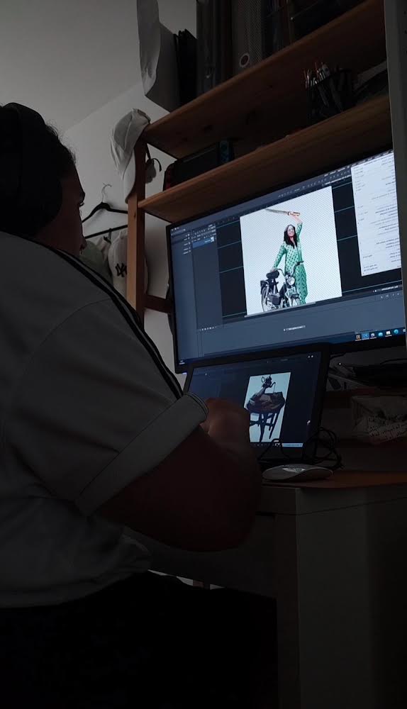
Sfiya: We kept the same symbols, but we replaced the old Spanish characters with Moroccan ones. We made a few changes to fit our values too. For example, this is a feminist card game—the most powerful card of the game is the queen. Our kings are babies, the children of the queens. All our knights are women with motorcycles. In Morocco, the only city where you see women riding motorcycles is Marrakesh. Each time we go there, we are just so fascinated. All these women were riding motorcycles, while still wearing their Djellabas and Kaftans. This is all coming from our version of Moroccan feminism.

DZ: We added symbols that would fit the concept of our collection too. The knives for example, are from Morocco. Our queens are also dancers. We wanted the cards to represent how we see our country every day and the power of feminists from Morocco. 

Sfiya: In Morocco, it’s called “shikhat” and up to now, they are very controversial figures because they were the first women to have a free relationship with their bodies. The first to think about politics, love, relationships and sexuality. They would sing and dance in front of a mixed audience, and they were often related to prostitution because of their relationship with their bodies. For us, they were icons, Moroccan feminists, which is why we wanted to have them as the queens of the game.

SA: Is there a piece that you are particularly proud of or that holds a lot of significance to you?

DZ: I feel like mine is the warrior on the bike with a knife, where she’s almost screaming. It’s a beautiful and powerful card. I think it’s one of our best ones.

Sfiya: For me, it’s the queen with the tea being poured on her. She looks very happy. Some people see something very sexual in it, but I don’t. When I was drawing it, I felt it represented freedom, the ability to dance and be a bit provocative. 

SA: How did you combine your artistic skills for this project?

DZ: At first, we disagreed about the style. Sfiya wanted something that looked like a painting, and I wanted something cleaner, more numeric, and refined. It was challenging for me to adapt to her style.

Sfiya: Yeah. For me, it was good exercise to try and get out of my comfort zone. Donia is also a graphic designer, so when she tells me that these colors won’t work, or comments on anything technical, I trust her opinion. We trust each other.

DZ: We did a lot of compromising as well. The first drawing Sfiya made, I redid it in a more comic-like style. I defined the lines a bit more, but she insisted I keep using painting brushes, so I tried following her style. It was hard not to have something completely clean. 

SA: Are your drawings mainly digital or did you implement other styles and techniques as well?

Sfiya: It’s all digital, but it somehow looks like a painting because I’m a painter. It was not even done on purpose, it’s just my way of doing digital art. We also wanted to make these cards different from other types of cards. We wanted them to be simple and clean, but also artsy so it won’t look too rigid as a drawing. I think the artistic brushes are what makes them unique.

Serena Abouljoud: What did the production process look like?

Sfiya: The process of creating the cards was very long. We went through two different phases. At first, Donia was waiting for me to finish the drawings, then I was waiting for her to finish the graphic design work, which is taking my drawings, framing them, and doing all the regulations.

DZ: I was in charge of the more technical aspects and printing related things. Our first tries were completely different from what we ended up producing. We changed the colors a lot. We started with lighter ones, then we decided to go with more powerful shades. It was difficult to find balance but once we found it, we immediately moved on to the production.

Sfiya: One of the most challenging parts of the production was trying to find a place to print the cards. We wanted to be ethical about it because it’s a project that meant a lot to us, we had many of our values injected into it, and so we wanted to be proud of not just our creation, but also the way we produced it.

DZ: After months and months of looking, we finally found someone. Our deck turned out a bit different because we did not use classic paper. We used a type of paper that does not exist in Canada but has much better quality.  

Sfiya: Yes, it’s better because it’s waterproof and you can’t tear it apart. We wanted it to be sustainable so that people can have it for years, and for kids to be able to play with it and manipulate it without being worried. We could have printed them in some place much cheaper, but we wanted to make sure we do it here to help local and family businesses, and with people we like and share the same values with.

SA: What is the meaning behind the name of your business?

DZ: We thought about it a lot. We wanted a name that is meaningful and shows that we are a feminist company. Darone is basically Ronda, the game we got inspired by, but in reverse. Darone is also a powerful way to say “the mother” in French: the mother of a family, a group, the boss of the house.

Sfiya: When you use the word “Darone,” it does not necessarily relate to having a child—it’s about being a powerful yet caring woman. In our card game, the queen is the most powerful figure, and the king is the child of the queen, which makes her a Darone.   

DZ: We talked about it a lot and in the end, we thought this was obviously the best name for the company and the concept in general. 

Categories
Arts Arts and Culture Exhibit Student Life

How a bike becomes home

A group of artists who cycled Canada from coast-to-coast displayed their photographs at the Woodnote.

ViaVélo was a temporary photography exhibition organized by Concordia student Sampson McFerrin and Luke Welton at the Woodnote Solidarity Cooperative between Sept. 15 and 17. The Concordian shared a friendly conversation with McFerrin regarding his experience organizing the show, the works on display, the team’s curatorial choices and the idea behind the exhibition. 

McFerrin’s parents are both avid cyclists, therefore he and his brothers grew up cycling and exploring the world on their bikes. He spoke of the inherently healthy and unique lifestyle that comes with regular cycling. The activity became an inseparable part of his identity—as an adult he began to seek out opportunities to explore different parts of the world through cycling and build a community to share his passion with. 

McFerrin is a Print Media major at Concordia University with a minor in Business—a combination that gave him the tools to successfully organize ViaVélo. The exhibition presented a collection of memories from his coast-to-coast journey across Canada. Photography and documentation captivated him during his earlier travels and these creative tools served as inspiration for the trip and offered him means to capture it.

 The gallery consisted of two rooms that displayed a collection of photographs and paintings by McFerrin and Welton. The photos encapsulate the experience of the two artists and a few others, who cycled from Victoria, British Columbia, all the way to St. John’s, Newfoundland, spanning 10 provinces and over 11,000 km. They started their journey during the summer of 2020  before they were interrupted by the pandemic’s restrictions and finished their adventure in 2023. 

Photograph from the ViaVélo collection. Courtesy of Sampson McFerrin.

By displaying the photos of their trip, the artists aimed to represent their journey and introduce different ways of seeing Canada. Through storytelling and captured memories of friendships, community and their lifestyle on the road, the exhibition proposes a new perception of the Canadian experience.

Viewers were met with photos of all 10 Canadian provinces, which McFerrin noted really capture the essence of the specific place and time it was taken. The presence of McFerrin’s bike in the gallery space, loaded with all the necessities for the trip, adds to the vivid memory of their life on the road. “The bike became the home that you take care of, and it takes care of you,” McFerrin said.

Categories
Arts Arts and Culture Exhibit

When birds echo humanity: the uncanny art of Mara Eagle

Birds or humans? Eagle blurs the lines with “Pretty Talk.”

Concordia’s FOFA (Faculty of Fine Arts) Gallery has been echoing with all sorts of unsettling sounds this past week. Not to be alarmed,  it has simply been hosting Mara Eagle’s “Pretty Talk” exhibition.

Eagle, an American artist, has designed a unique audiovisual experience for her audience. Stepping into the FOFA Gallery, it is impossible to ignore the strange yet familiar sounds that pierce the heavy black curtain separating the exhibition room from the receptionist’s office. Behind the curtain, an incongruous setting is revealed: in the middle of a dimly lit room surrounded by a white picket fence, the only furnishings are two white Adirondack chairs placed on a faux grass tile. 

Viewers watching “Pretty Talk,” FoFA Gallery, Concordia University. Photo by Emma Bell / The Concordian.

On the wall facing the chairs, a 15-minute 3D animation—rendered in a disturbing, uncanny-valley-like style—is projected on a loop. On the opposite wall, a descriptive sheet indicates that the soundtrack—which sharpens once the viewer enters the space and reveals all manner of human noises such as farts, baby cries, laughter, screams and more—is in fact made up of bird mimicry. 

In the short animated film, increasingly repulsive characters appear in turn, such as a huge infant with facial and torso hair and a grandfather with shark-like teeth. They are merely pale imitations of human beings: their jerky movements, misshapen and offbeat facial expressions, grotesquely proportioned bodies, and lifeless eyes all betray their artificiality and send chills down the spine.

The soundtrack is composed of hundreds of fragments of mimicked human sounds, which combined to the visuals make for a rather horrifying experience. The superimposition of the muffled and high-pitched bird mimicry noises creates a cacophony that sounds alien. 

Mara Eagle discussed her work at the vernissage for “Pretty Talk,” FoFA Gallery, Concordia University. Photo by Emma Bell / The Concordian.

The 3D animation and accompanying soundtrack are played in a loop until the gallery closes, allowing viewers to watch the whole thing as many times as they need to absorb the work’s weirdness. Afterwards, the audience can watch a seven-minute video about the artist’s creative process in a more intimate screening room toward the exit. 

On the screen, Eagle explains that she created the soundtrack first and foremost. The visuals were thereafter created to fit the sounds and were animated by her collaborator Calum MacConnell. Eagle explains that she spent a long while researching and collecting hundreds of hyper-realistic bird mimicry sound samples on the internet using YouTube and other platforms, for she wanted her project to be very low budget and DIY. She then collaged and organized all the bird sound samples, which ended up making a 15-minute soundtrack. She was inspired to make her project into a loop because of how repetitive bird speech tends to be. 

The bizarre, interesting and complete experience of “Pretty Talk” is not only enthralling, but it also serves a good cause. Eagle is working in collaboration with a Quebec-based organization called Perroquetsecours to raise funds towards rehoming birds that are in need of adoption. Her tote bags are for sale at the FOFA gallery for $25 and all of the proceeds will be donated to this cause.

Tote bag for “Pretty Talk,” FoFA Gallery, Concordia University. Photo by Emma Bell / The Concordian.
Categories
Arts and Culture Student Life

What is FASA and What Does it offer?

Concordia’s Fine Arts Student Alliance hosted their first orientation event of the school year.

Concordia University’s Fine Arts Student Alliance (FASA) is a student-run organization that provides funding, creates several clubs and organizes art shows for all students within the faculty of fine arts. It is committed to being an inclusive, diverse, accessible and welcoming community for all students. FASA 101 was a recent event organized by the FASA members at Concordia’s VAV gallery located at the Sir George Williams campus on Tuesday, Sept. 12. 

FASA 101 Zine Workshop, VAV Gallery. Courtesy of FARR Concordia, Photo by India-Lynn Upshaw-Ruffner.

This event was an orientation gathering that brought together all the clubs under FASA. The aim was to provide a better understanding of the association and the opportunities it offers to new students. As one of the members mentioned, “it is basically an event where you should drop in, make crafts, meet friends while getting to know available opportunities.The Concordian was able to attend the Mindful Campus Initiative presentation—part of the many presentations and workshops that took place during FASA 101. 

The association representatives explained FASA’s dedication to the well-being of the fine arts students. The presentation outlined offered online courses focusing on stress and anxiety management tips, on campus services and activities for students to take advantage of as they navigate their coursework. 

The representatives also discussed the potential difficulty students may have as they begin to get involved on campus. It may seem overwhelming at first for new students to pursue joining new clubs in an unfamiliar environment, but FASA’s mission is to make the process as accessible as possible.

FASA offers several opportunities that can help students get involved in the university. Some of the best ways to get involved are by following callouts for upcoming exhibitions or events, volunteer work, jobs and grants. The best way to access all of these opportunities is through their websites, Instagram accounts, and email subscriptions. 

The VAV gallery’s general meeting is one of the upcoming events that will be hosted on Sept.21  at the gallery to elect the board members for the 2023–2024 academic year. Undergraduate students in the fine arts department are welcome to attend this event—whether to simply become familiar with the operation and members of the gallery, or to nominate themselves for one of the positions available! 

Categories
Arts and Culture Exhibit

Lasting Impressions: Showcasing the Possibilities of Print

Webster library hosts a retrospective exhibition from Concordia’s special edition program.

As students begin to use the Webster library during the first few weeks of the school year, some may notice the vitrine display to the left of the entrance stairs. Concordia’s special editions program within the Print Media Department currently has a temporary exhibition on display titled Lasting Impressions. Founded in the 1990s by Judy Garfin and Cheryl Kolak, the program “fosters creative, collaborative and pedagogical opportunities for visiting artists, master printers and students.” This exhibit was curated by Director Erika Adams and showcases a retrospective collection of works produced over the past couple of decades that demonstrate the breadth of techniques that artists have engaged with. 

The printmaking techniques range from lithography to screen printing, and each artist contributed a unique visual language to the body of work.

Lithography is a fairly complicated method that takes advantage of the way water naturally repels oil. A drawing made on a textured, stone surface with oil based materials is etched into the surface through a chemical process. Once the oily image is fixed onto the stone, the artist will pass a wet sponge over the surface before rolling on an oil-based ink. With the properties of oil and water at work, the ink will only stick to the oily image, while the watery negative space remains clean. The artist can now transfer the image onto paper by running it through a printing press. 

The nature of lithography allows for a more detailed result—every mark made by the artist will appear in the final print, thus there is more opportunity for value, complicated linework, and an overall painterly appearance. Take Betty Godwin’s 2003 Escape for example: at a glance, this print appears to be a drawing. This simple lithograph features a diving figure whose elongated body is rendered with a quick hand. The diver’s limbs are mere suggestions constituted of hasty linework and smudged ink. A quiet object, perhaps a pillar, in the background softly emerges through more linework. This level of delicacy, texture, and value beautifully captures the possibilities of this method. 

Betty Goodwin, Escape, 2003, Lithography on paper, 46 x 31 cm, printed by Chris Armijo. Photo By Emma Bell / The Concordian

In contrast, silkscreen printing, or serigraphy, lends itself toward the bright and the graphic. A method of choice for poster artists and activists, this printmaking technique favours boldness. The process involves separating an image into colour layers and turning those layers into stencils. The stencils are then fixed to a stretched silk screen, where the artist will then pass over with a squeegee to transfer the ink onto the paper layer by layer until the image is complete. Pierre Dorian’s 2008 print Stairs aptly demonstrates this technique. The bold lines, solid colours and overall graphic qualities of the staircase are highly characteristic of serigraphy.

Pierre Darian, Stairs, 2008, Silkscreen on paper, 76 x 62 cm, Printed by Mikael Petraccia. Photo by Emma Bell / The Concordian

The discipline of printmaking values the process of creation just as much, if not more, than the final print itself. As you spend some time with the works here, try to notice both the limitations and possibilities of each method and how it complements the subject matter.
Lasting Impressions will remain in Concordia’s Webster library until September 25, 2023.

Exit mobile version