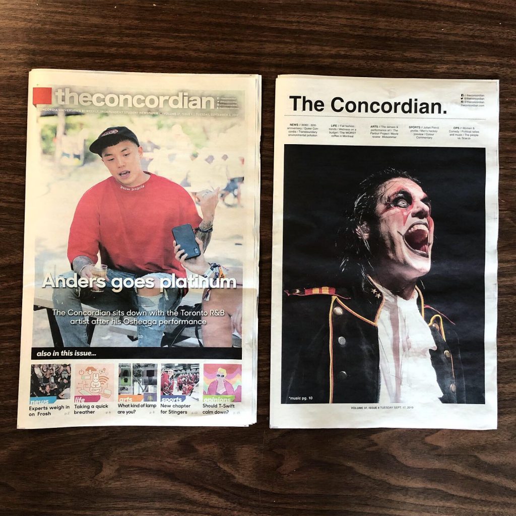
So, you may have noticed The Concordian looks a little different this week.
The simplicity that is the additional white space, the large font and cut-out images is something we’ve been wanting to try for a while – it just took us a couple weeks to get here.
In line with our recent shift to bi-weekly publications, we decided to reimagine the paper’s layout to bring it into the 21st century. Times are a-changin’, people, and we’re going to do our best to change with them, while maintaining our position as the bearer of news for the Concordia community and beyond.
We are hoping the simplistic view will allow our content to speak for itself as we move away from the look of a ~traditional newspaper.~
REST IN PEACE, fonts of our past. Sharp sans no. 1 bold, Brandon and Grafata; you’ve been good to us. But this is goodbye.
So, what can you expect from us moving forward?
With a new team comes new content. Some of last year’s columns have been put to sleep to make way for new ones; ones that will keep you up to date on world politics and developments in the scientific world, for example.
With YUM or YIKES, you’ll be guided through which Montreal restaurants to indulge in and which to avoid like the plague.
What remains consistent, though, is our commitment to the Concordia community and to producing top content while helping to train the next generation of young journalists.
As always, we welcome new writers and pitches with open arms. Is there something you’re so painfully passionate about that it keeps you up at night? Would writing about it help you release some of that energy? Tell us about it. You’re looking at a group of people who spend production days intermittently listening to Hannah Montana songs, so there really is no judgement on our end.
We’re here to work for and with you, and we hope you like the new look.
Feature photo by Alex Hutchins