Photography is as easy as one, two, three!
Are you ready to switch out the average camera on the phone in your pocket for a more professional camera? The team at the Concordian put together a simple guide to help our fellow photojournalists out with some advice based on journalistic situations you would find yourself in.
To start things off, before you even start fiddling with your camera settings, set your camera to Manual mode. This will give you full control of the camera versus other default settings where the camera might automatically adjust settings based on the situation.
Understanding the basics of your camera –
Now that your camera is in Manual mode, you have to understand the interaction between light and the camera, also known as the exposure triangle. The exposure triangle balances three elements: your shutter speed, ISO, and aperture.
Think of shutter speed as curtains for a window. Your shutter is the curtains that close inside the camera when you press the button to take the picture. It essentially opens and closes the shutter to either slow down or freeze movement.
Imagine you open and shut the curtains at 1/500 of a second. Not a lot of light can get in during the short time it was open, right? You maybe get one brief glance out your window due to how fast the curtains shut, but not the whole scene. However, if the curtains closed at 1/30 a second, think of how much more you could see. The longer the shutter stays open, the more information the camera takes in. Longer shutter speeds can lead to motion blur, while faster shutter speeds freeze motion.
Up next is your ISO, which is essentially light sensitivity. This concept goes back to the film days—each film had its own level and amount of light it was able to process. Think of it as a scale of light with 100 being a full sunny day and 3200 being nighttime. You can use this as wiggle room on your shutter speed or aperture.
One more thing to keep in mind is higher ISO also comes with a bit more noise, or grain, and the camera would work harder to capture the scene.
The final component of the exposure triangle is the aperture. A camera is basically a hole that opens, lets light in, and then captures it in its simplest form. The aperture allows you to decide the size of that hole—it can either be wide open and let lots of information in, or tiny and only let a little bit in. This determines how much of your image will be in focus.
Let’s say you just want to capture the foreground—whatever element is closest to your camera. You would use a smaller aperture of around F/2.8. For something like landscapes, where you would want everything in focus, we would suggest a wider aperture of F/14.
Different journalistic situations –
As long as these three elements balance, you can conquer a lot of the photojournalistic scenarios you’d find yourself in. Are you on the news beat? In a lot of situations, you’ll be taking portraits of your subjects for a visual. In these types of situations we would suggest:
- Shutter Speed: 1/100 or faster
- Aperture: F/1.8 – F/5.6
- ISO: 100-400
- Focus: Auto (AF)
- Focus Type: Continuous/Servo
- White Balance: AWB
- Drive Mode: Single Shot

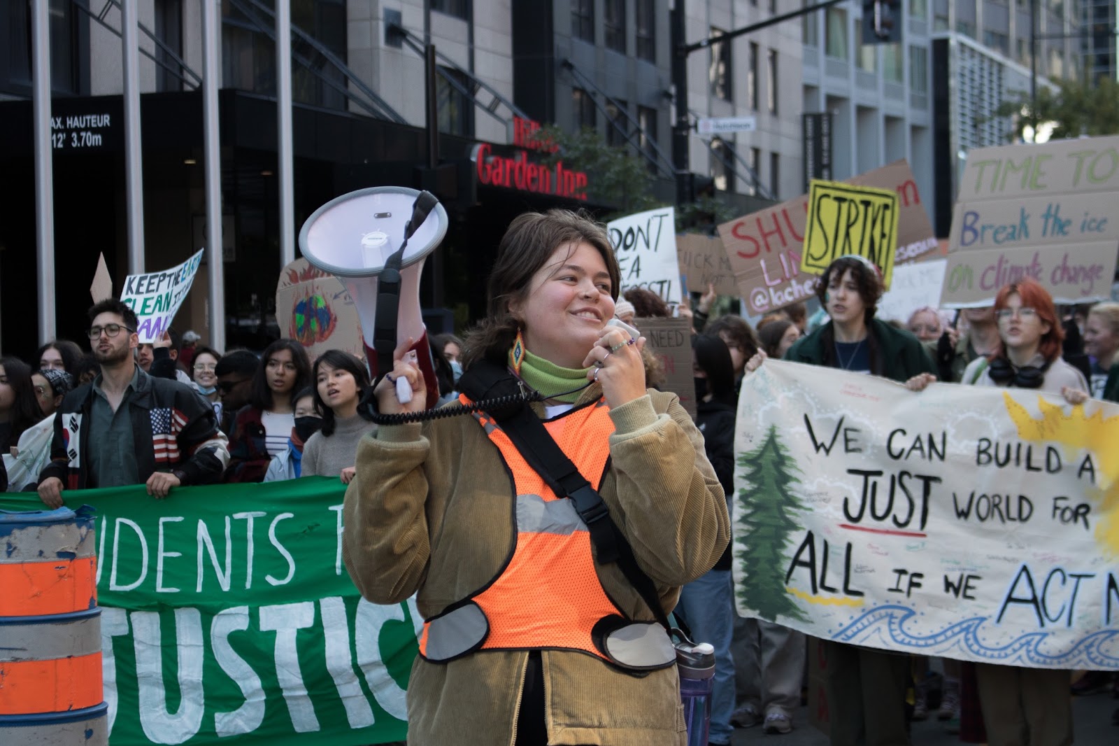
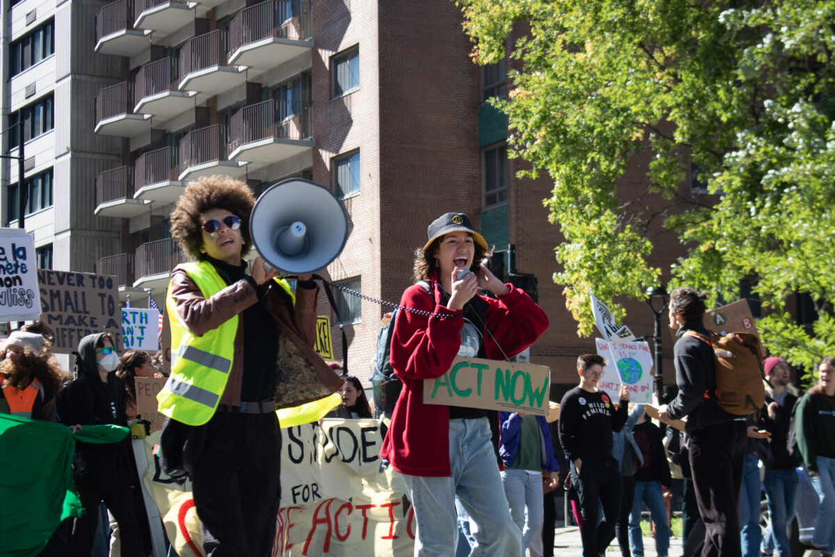
Student leading the climate protest in downtown Montreal on September 23, 2022. Photo by Dalia Nardolillo/THE CONCORDIAN.
Do you like to capture the action of athletes on the field during a game? We would suggest the following settings for sports photography:
- Shutter Speed: 1/500 at a minimum to ensure the movement is captured
- Aperture: F/2.8 – F/5.6
- ISO: 400
- Focus: Auto (AF)
- Focus Type: Continuous/Servo
- White Balance: AWB
- Drive Mode: Continuous/Burst
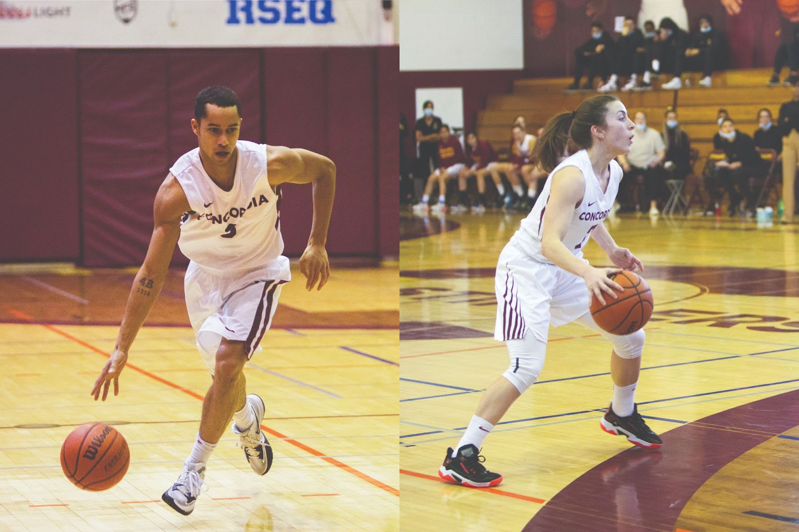
Photo by Catherine Reynolds / The Concordian
Maybe you prefer to photograph the emotion and excitement of a concert. This can be a little trickier with all the crazy lighting typical to shows. One important thing to remember is that red light is the hardest to photograph in. Here are some settings that we would suggest to elevate your concert experience:
- Shutter Speed: 1/250 or faster (pro tip: try lower for some artsy motion blur)
- Aperture: F/1.8 – F/4 ( preferably as low as it can go!)
- ISO: 1600 – 3200
- Focus: Auto (AF) as well as spot-metering
- Focus Type: Continuous/Servo
- White Balance: AWB
- Drive Mode: Continuous/Burst
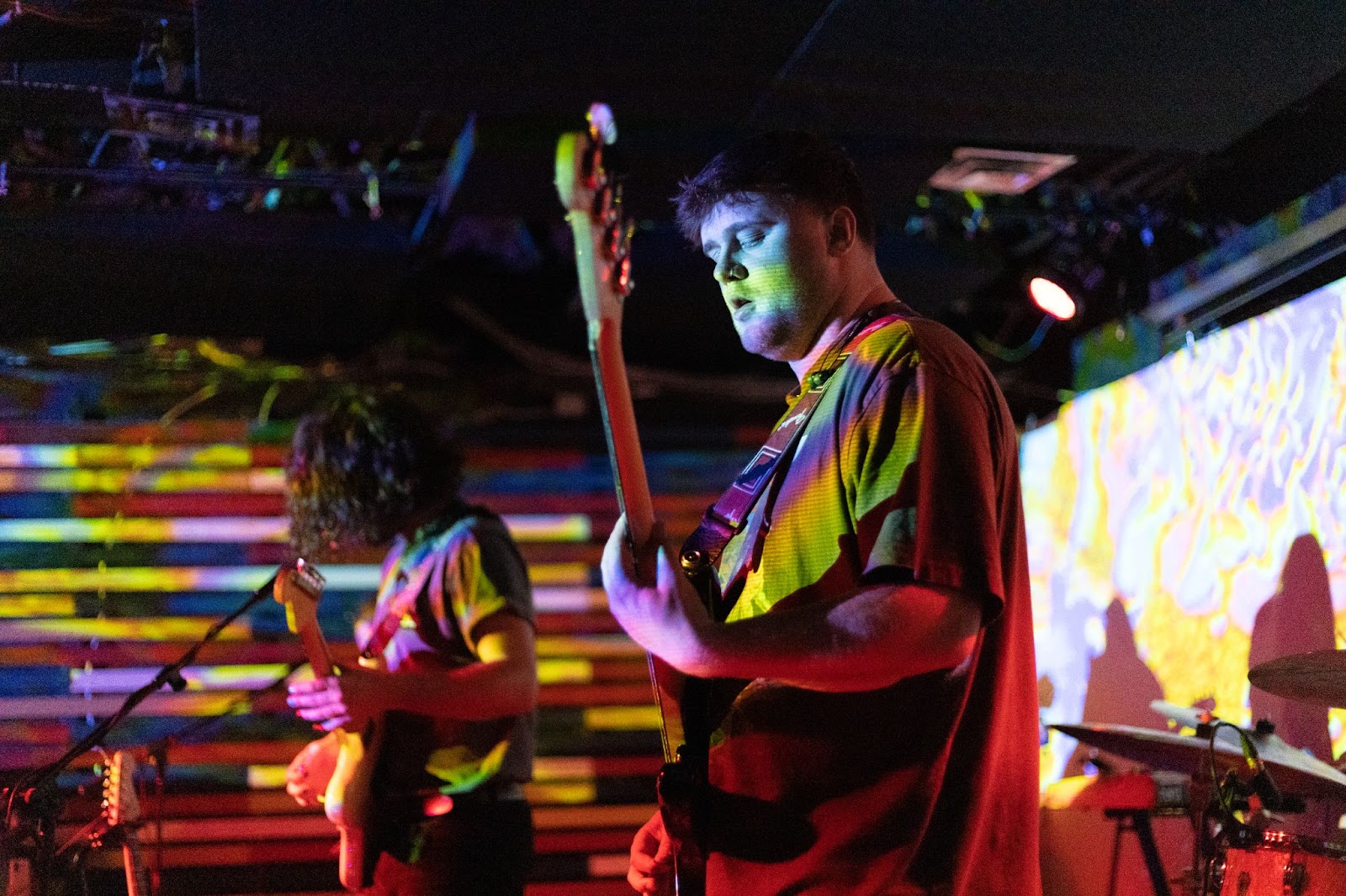
Photo by Catherine Reynolds / The Concordian
Long story short, this little guide does not cover every situation you’ll be faced with. It takes a lot of trial and error to figure out what works for you and we hope above all that this is a good start for your photography adventure!